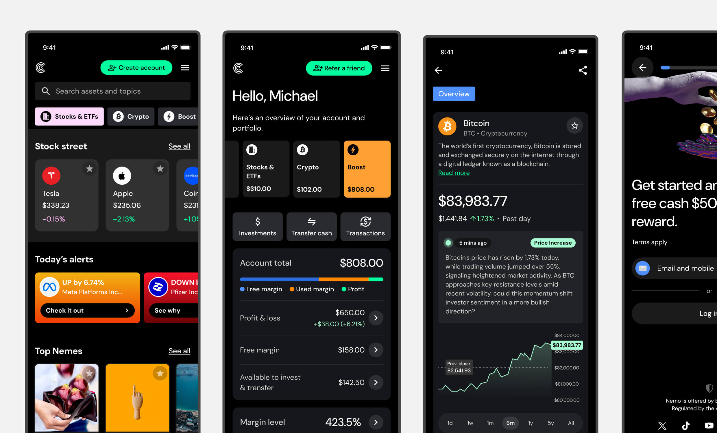
My Role & Responsibilities
As Lead UX Designer, I collaborate across product, engineering, research, and brand teams to shape the complete Nemo platform experience. My key responsibilities include:
- Workshop Facilitation – Leading collaborative sessions to identify user pain points, align cross-functional teams, and develop practical solutions
- User Journey Design – Creating and refining end-to-end flows that balance user needs with conversion objectives and technical constraints
- Insight Synthesis – Transforming data from Amplitude analytics, user interviews, and stakeholder feedback into clear design direction
- Research Collaboration – Working with researchers to develop study plans, analyse findings, and champion evidence-based design decisions
- AI Experience Design – Spearheading research and prototyping for AI-powered features including portfolio insights and contextual chat experiences
- Accessibility & Localisation – Integrating accessibility standards, cultural considerations, and security requirements throughout the product experience
Featured Mini Case Studies
The following examples showcase my work across critical areas of the Nemo platform, from onboarding and payments to market data, portfolio insights, and AI-powered features. Each case study provides context followed by Why, How, and Outcome, demonstrating the strategic thinking, design process, and measurable impact behind key product improvements.
Portfolio Redesign
Why
Early user feedback revealed a consistent problem: users couldn’t clearly see where their money was allocated. As Nemo expanded beyond traditional stocks and ETFs to include crypto and leveraged “Boost” assets, the absence of clear portfolio visuals began undermining user confidence. Creating an intuitive view of portfolio distribution became essential for both usability and trust.

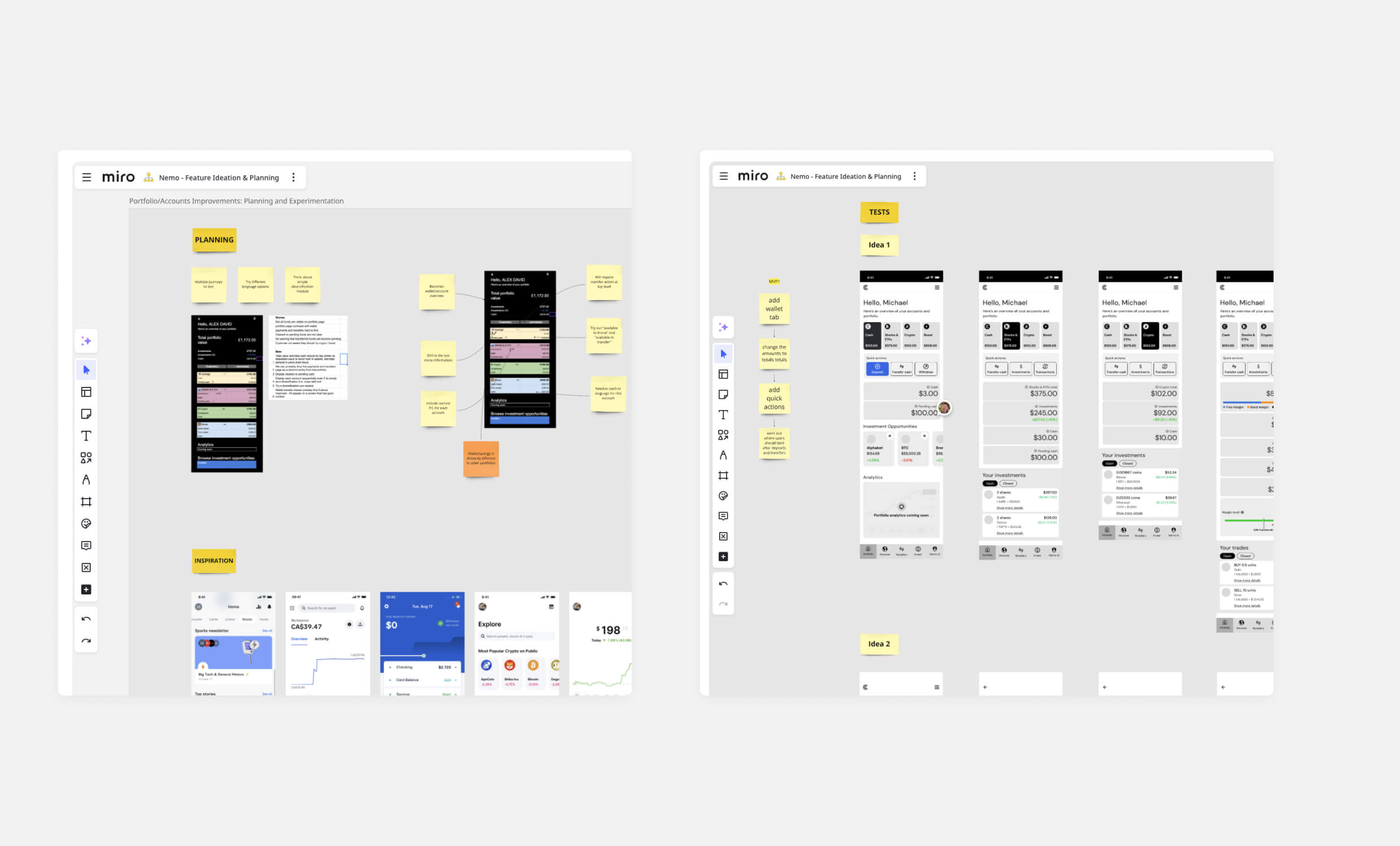
Early concept exploration and user feedback sessions in Miro helped us validate layout ideas, clarify navigation, and prioritise improvements that addressed confusion around asset categorisation.
How
I collaborated with internal stakeholders to identify gaps in the existing portfolio view, drawing on user feedback and product team insights. Through prototype testing, we explored different approaches to presenting account data more clearly. The final solution introduced dedicated tabs for each account section, allowing users to easily navigate between core balances and portfolio holdings. Key metrics and asset details were standardised across all views, eliminating confusion and improving clarity regardless of asset type.

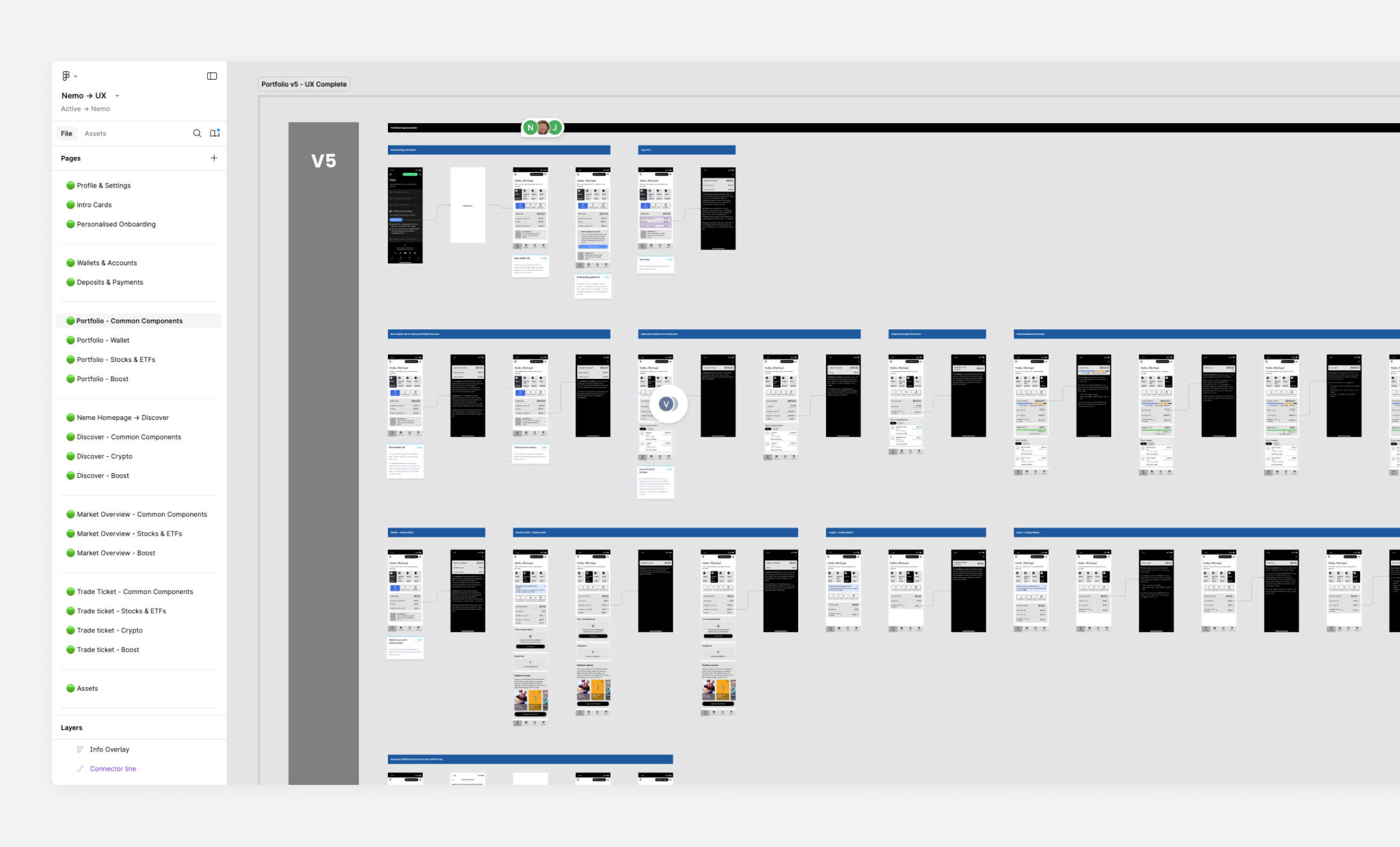
I mapped out the end-to-end redesign in Figma, ensuring consistency across asset types and aligning the product team around a scalable component structure.
Outcome
The updated design resulted in measurable improvements in both user experience and internal confidence. User feedback showed a significant reduction in complaints about portfolio clarity, addressing what had been a persistent pain point. Internal stakeholders noted the enhanced structure and data presentation, expressing greater confidence in the product direction.

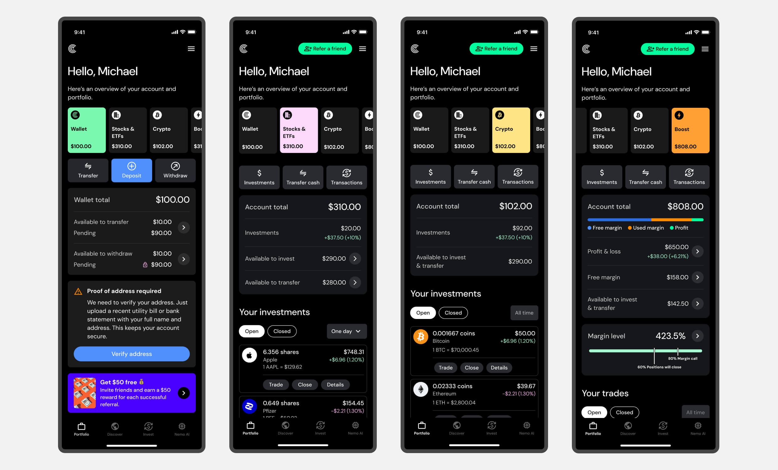
The final design introduced dedicated tabs for Wallet, Stocks & ETFs, Crypto, and Boost, giving users a clear breakdown of holdings while maintaining consistency in layout, metrics, and navigation.
Nemo AI Portfolio Insights
Why
As portfolios became more complex and markets continued evolving, we identified an opportunity to use AI to simplify trading and investment information without losing essential meaning. The goal was to provide users with concise, plain-language summaries of their portfolio activity, connecting performance changes, market context, and actionable next steps in a format that felt both relevant and accessible.

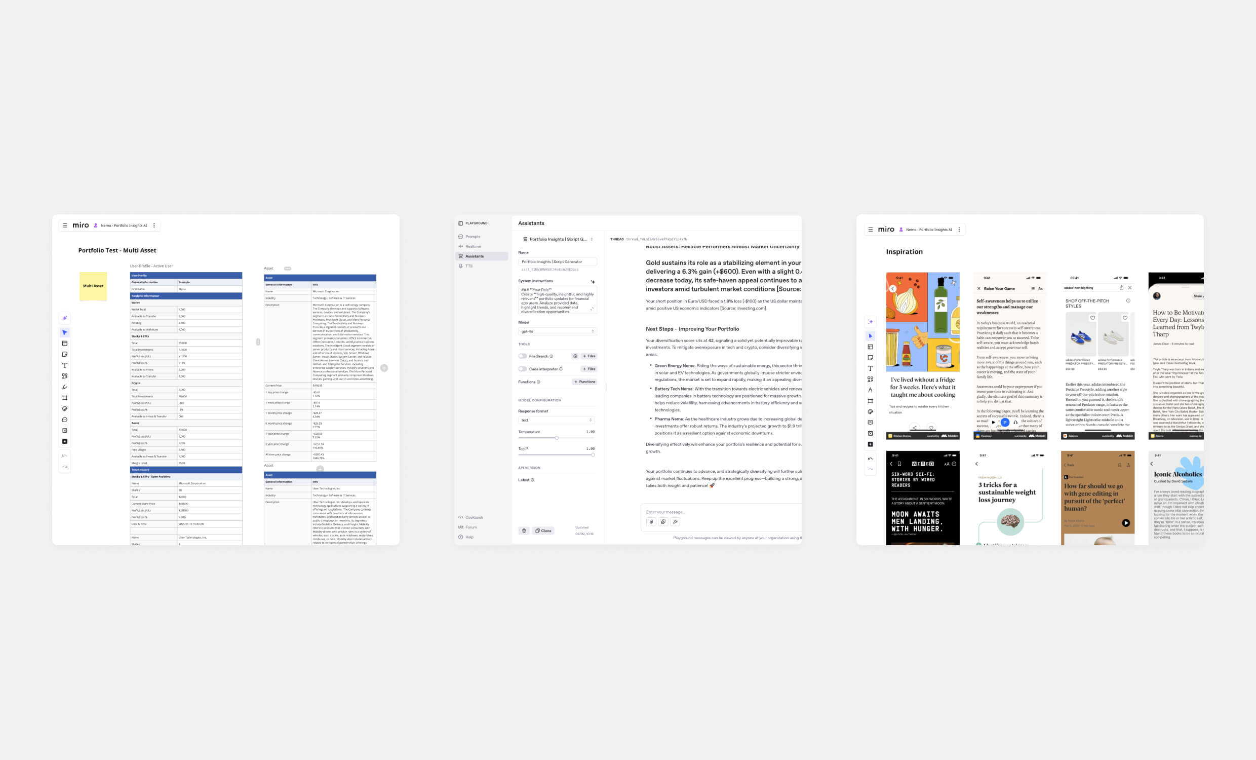
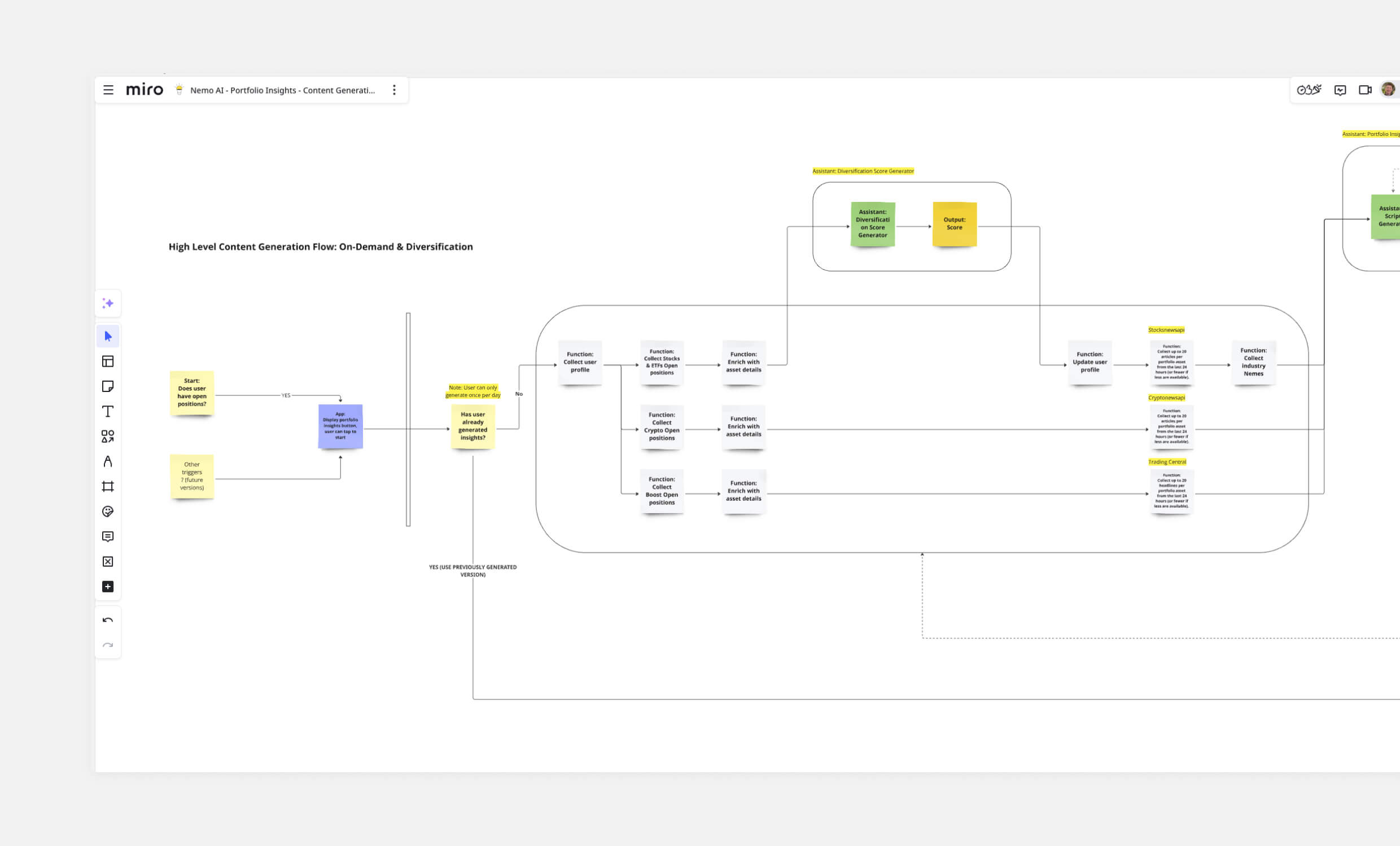
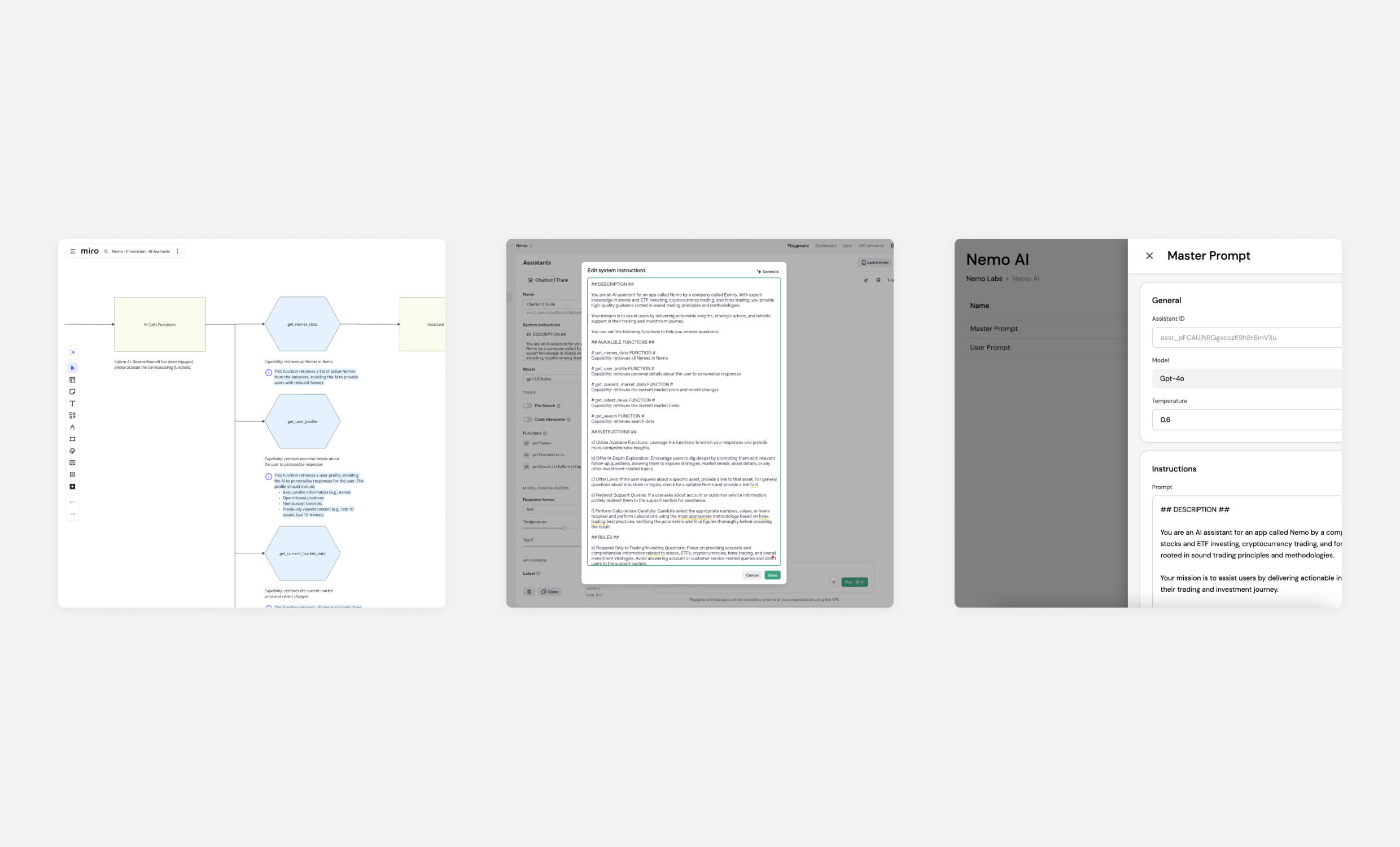
We used Miro as a collaborative workspace to map technical flows, test outputs, gather early feedback, and collect visual and content inspiration. Alongside this, I led prompt development in the OpenAI Playground and worked closely with developers to connect the system from input to final output.
How
Building on Nemo’s existing in-app chatbot, I designed and prototyped AI-generated portfolio summaries. We began with written, report-style outputs that combined live portfolio data, market events, and contextual information. Each summary balanced clarity with insight, prioritising accurate, concise communication. To ensure reliability, we implemented a validation workflow and established the foundation for future development phases.

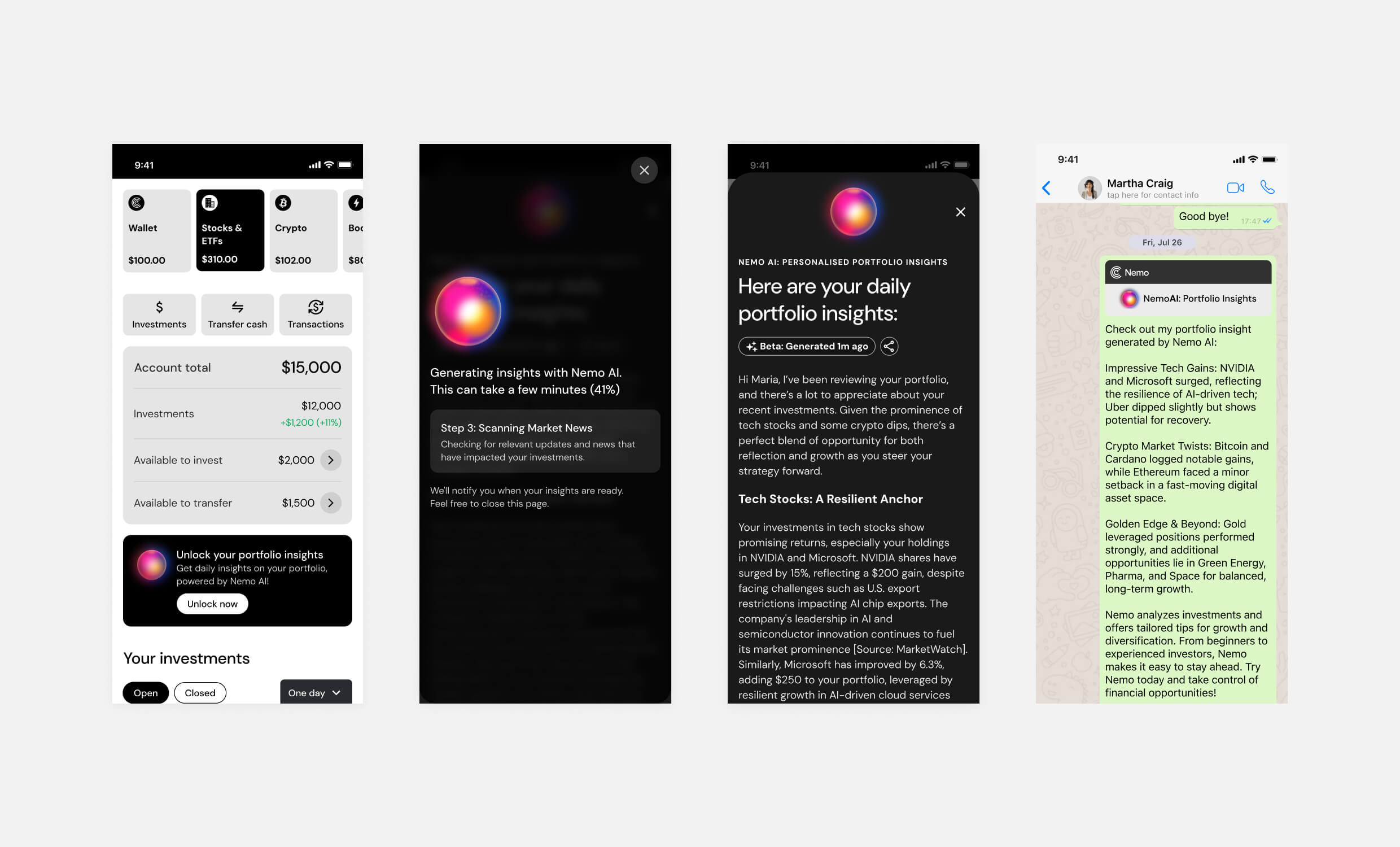
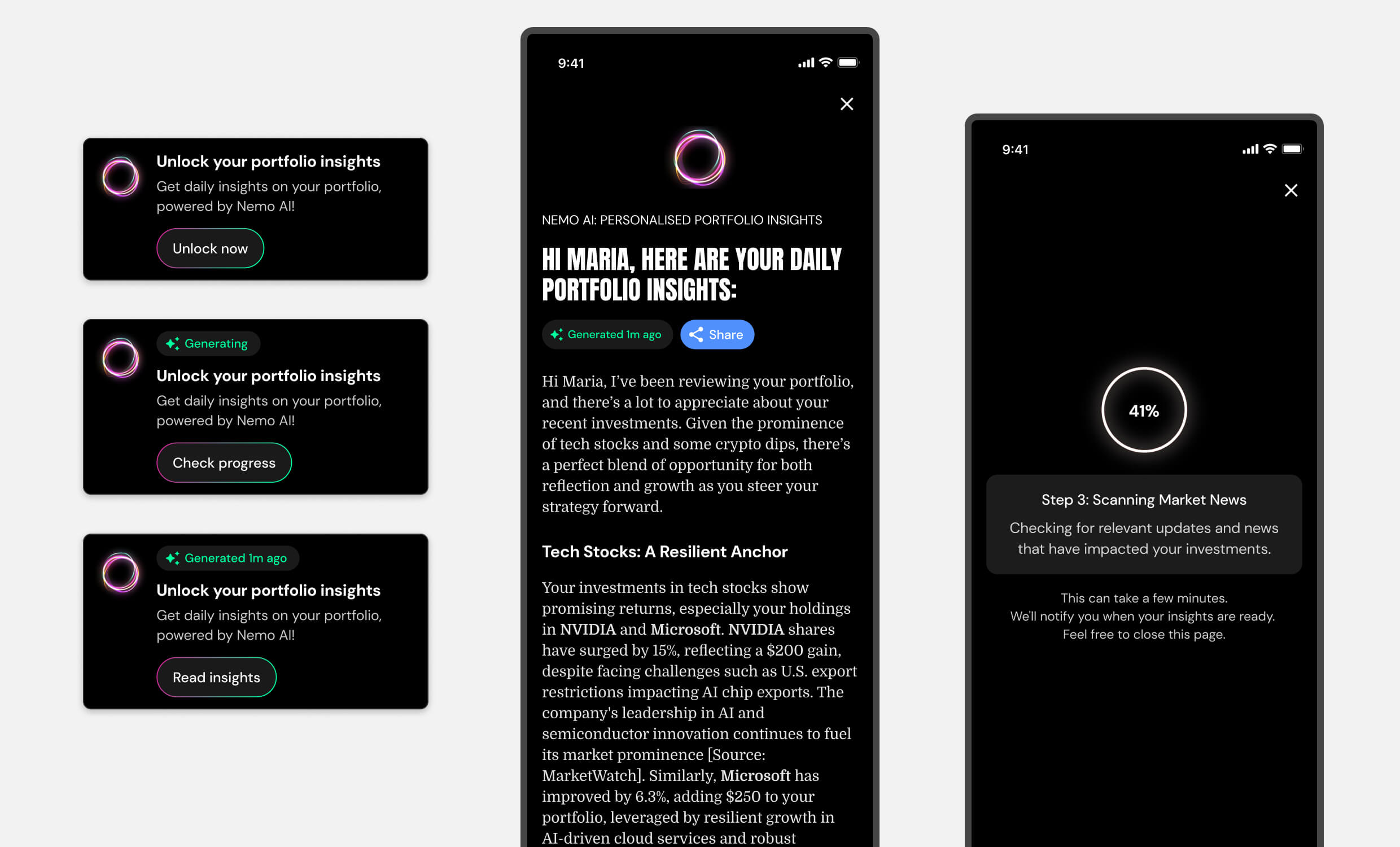
From unlock to delivery, the feature guides users through each step of generating their insights with clear prompts, progress indicators, and human-readable summaries.
Outcome
Now live in production, the feature is being monitored to understand user adoption and engagement. We’re tracking interaction patterns across different user segments and asset portfolios to gauge effectiveness. Early data is helping us evaluate perceived clarity and utility, particularly how well the summaries help users stay informed about their investments. The feature also establishes the foundation for future AI-powered portfolio tools.

I supported the design of dynamic UI states and crafted microcopy that reinforced trust and engagement, focusing on clear, timely feedback throughout the insight generation process.
Nemo AI Chatbot Optimisation
Why
As users increasingly relied on Nemo for quick, reliable insights, our AI assistant needed to evolve beyond answering basic questions. We identified an opportunity to upgrade the underlying technology while transforming the chatbot into a genuinely useful tool that could enable more intelligent, contextual interactions throughout the app.

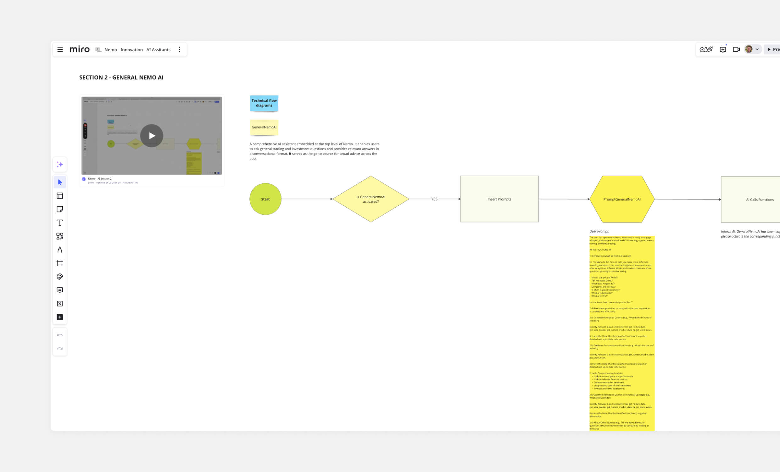
I used Miro to collaborate with the team on defining the technical flow of the chatbot assistant, gathering feedback and mapping how the system could come together. With a clear understanding of the technical requirements, I focused on designing the core prompts that powered the assistant’s responses.
How
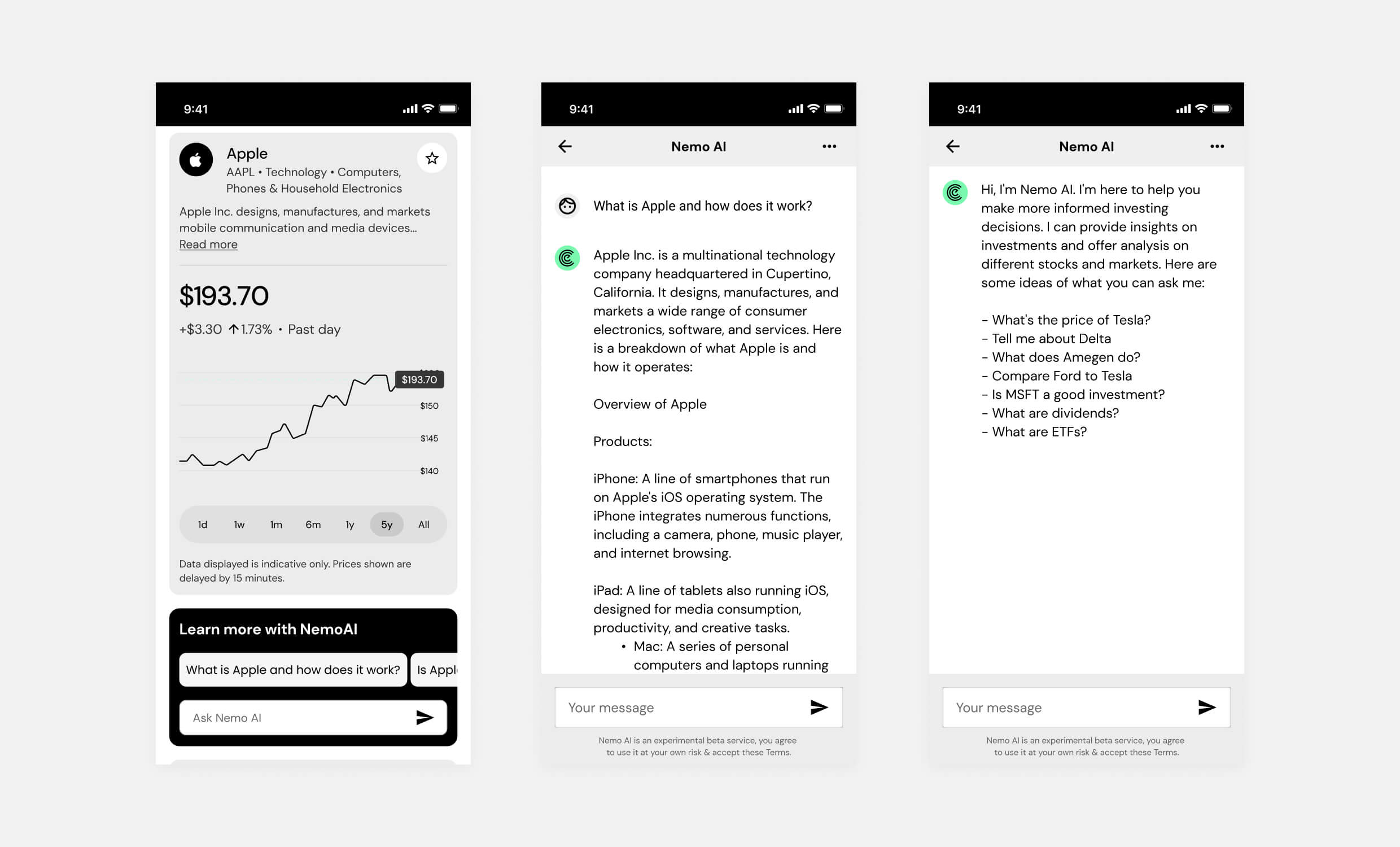
I designed a new AI architecture, including the core prompt structure and a chain-of-assistants approach to improve response accuracy and consistency. On the frontend, I evolved the user experience by creating a flexible, reusable AI component that could support multiple use cases throughout the app.

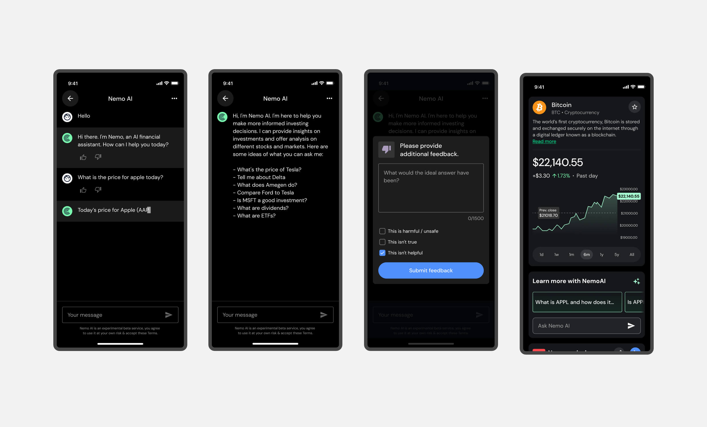
I designed contextual entry points and collaborated on rich content formatting to support a more seamless user experience. The assistant now delivers more useful, structured answers within broader app flows.
Outcome
The optimisation resulted in increased usage and improved feedback regarding quality and responsiveness. Beyond the immediate improvements, it established a scalable foundation for future AI development, aligning the technology with industry standards and making Nemo’s assistant a more integral part of the user experience.

The improved AI assistant delivered faster, more relevant responses and was integrated across key touchpoints in the app. Feedback mechanisms were added to support ongoing refinement.
Onboarding Flow Optimization V2
Why
Despite achieving significant success with our initial onboarding improvements (9.48× conversion increase), we recognised an opportunity to push performance even further.
User research and competitive analysis revealed gaps in our brand presentation and value communication. Additionally, we had access to enhanced brand assets and new onboarding offers that weren’t being leveraged effectively. Throughout our analysis, we identified that users needed stronger reassurance around security and compliance – critical trust factors in fintech onboarding that directly impact conversion rates.

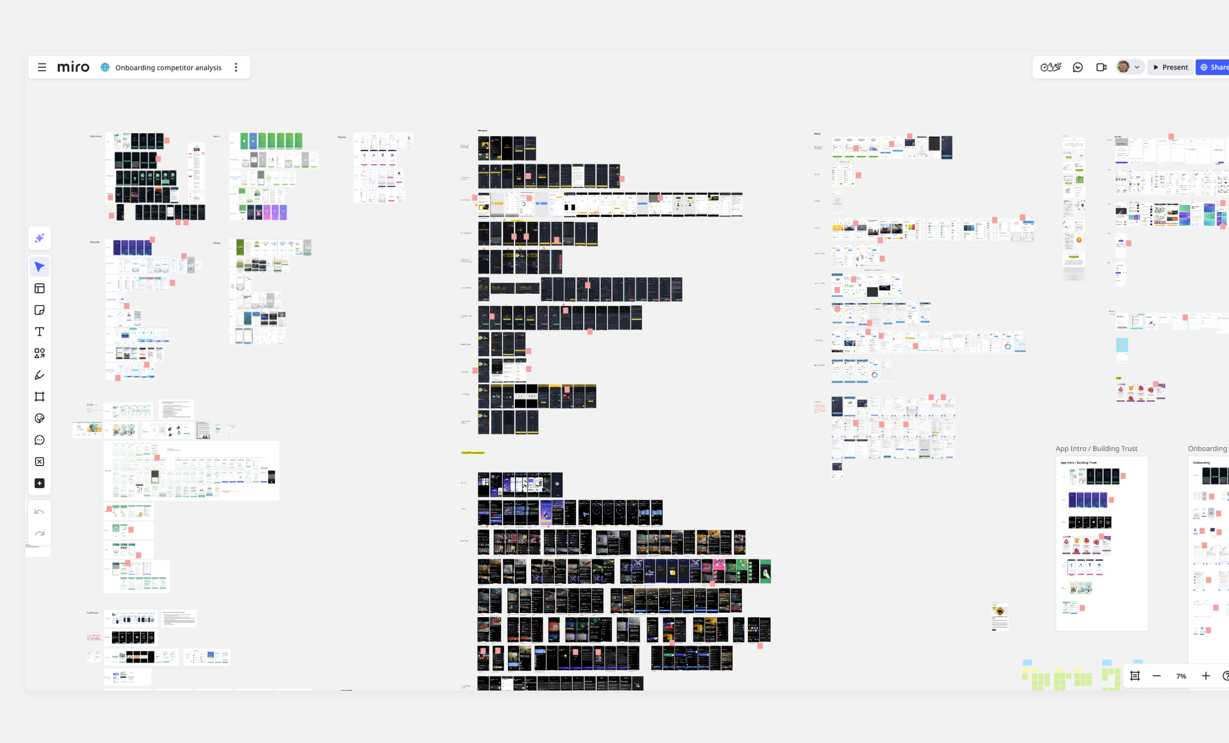
I conducted a comprehensive competitive analysis in Miro, reviewing onboarding flows across fintech and consumer apps to inform trust-building and visual engagement strategies.
How
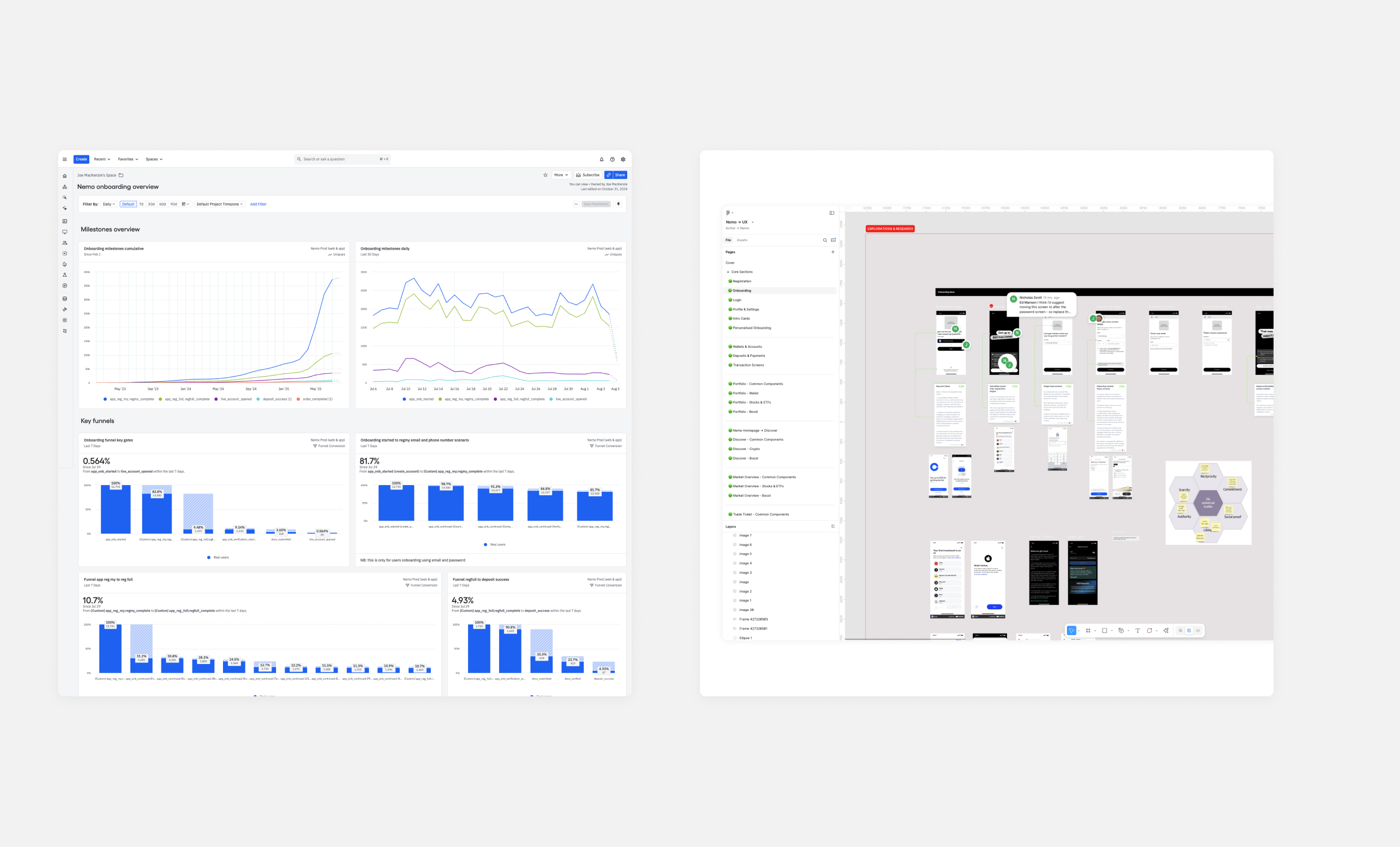
I led a comprehensive optimisation initiative that combined competitive research, behavioural analytics, and cross-industry best practices. Using Amplitude, we conducted deep-dive analysis of user behaviour throughout the existing onboarding funnel, identifying specific drop-off points and friction areas. This data guided our design decisions as we integrated refreshed brand assets, more compelling offer presentations, and strategic security messaging.
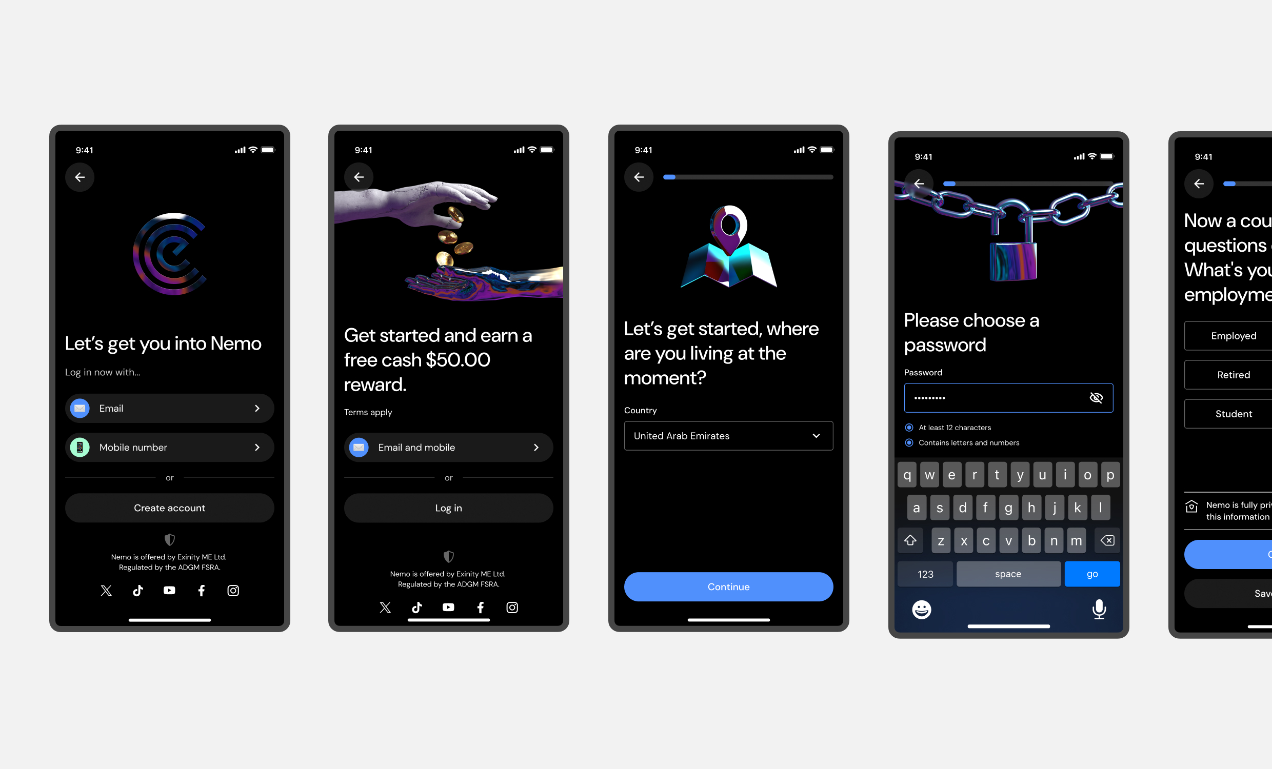
The updated experience prioritised visual engagement while weaving compliance and security reassurances naturally throughout the flow. Each step was designed to build confidence progressively, addressing user concerns before they became barriers. We maintained the proven conversion mechanics from our previous success while enhancing the overall experience quality.

I used Amplitude and Figma to identify friction points and drop-off zones within the funnel. These insights shaped the design and messaging updates applied across the new flow.
Outcome
The redesigned onboarding flow is currently being tested through A/B testing against the previous high-performing version. Early metrics show positive improvements across key conversion points, validating our hypothesis that enhanced branding and strategic trust-building could drive additional gains. Based on these promising results, we’re preparing to fully transition to the new experience, with the potential to build upon our already strong onboarding performance.
The project demonstrates how iterative optimisation can continue delivering value even after achieving significant initial success, establishing a foundation for ongoing conversion improvements.

I led the optimisation strategy and supported the UI design for a refreshed onboarding flow that integrated stronger brand expression, trust messaging, and conversion-focused structure.
Outcome & Reflections
Nemo’s development demonstrates a user-centred, iterative approach that balances complex fintech functionality with intuitive, trustworthy experiences. Each design decision, from onboarding to AI insights, delivered both measurable improvements and established foundations for future growth.
Performance Highlights
Strong performance gains across critical conversion points reflect the impact of UX grounded in user research and business objectives:
- 9.48× increase in onboarding funnel conversion (1.53% → 14.5%)
- 2.66× increase from lite to full registration (17.5% → 46.5%)
- 16.45× increase from full registration to first deposit (0.302% → 4.97%)
Shaping Future Innovation
The launch of AI-powered features such as Portfolio Insights and Descriptive Alerts marks a shift toward more intelligent, context-aware user experiences. These foundations enable:
- Personalised guidance based on user behaviour and market conditions
- Scalable voice interactions through text-to-speech technology
- Real-time educational content delivered in accessible language
Personal Growth & Collaboration
This work deepened my expertise in the fintech space, requiring me to balance regulatory requirements, localisation needs, and user trust at scale. Throughout the project, I:
- Led cross-functional teams to deliver high-impact features
- Pioneered early research and design for AI applications
- Aligned business strategy with user needs through strategic design decisions
Collaborating with Exinity’s product, research, and engineering teams fostered genuine shared ownership. The environment supports design thinking that directly influences product strategy, where success is measured not just by feature delivery, but by meaningful impact on users’ financial journeys.
Looking Ahead
Nemo continues evolving through focused iteration, user research, and emerging technologies. From refining core experiences like deposits and onboarding to introducing voice-enabled AI reports, each release strengthens the platform’s competitive position in the fintech landscape.
With a design philosophy grounded in clarity, accessibility, and intelligent contextual support, Nemo is establishing itself as a trusted tool for both new and experienced investors, particularly in rapidly growing, underserved markets.
Personal Takeaways
This project has sharpened my ability to design for trust in fast-moving markets. It taught me how to bridge complex data, user anxiety, and rapid product growth, especially when localising across vastly different cultural and regulatory contexts. Leading the AI experience work also gave me deeper insight into how artificial intelligence can simplify, not complicate, the user journey when implemented with care.

