BBC Pandemic Application Design
I led the UX/UI design for BBC Pandemic, transforming complex epidemiological research into a citizen-science app that engaged over 100,000 participants across the UK. Working with scientists from Cambridge and London School of Hygiene & Tropical Medicine, I designed experiences that convinced everyday citizens to voluntarily share location data and personal interactions for pandemic flu research.
The app created one of the most significant citizen-science datasets ever compiled on flu transmission, informing national public health policy and BBC Four documentary programming.
Key Outcomes:
- Over 100,000 participants provided real-world movement data
- Reached #1 in Medical category on both iOS and Google Play
- Won App of the Year at Digital DNA awards
- Generated national media coverage and informed BBC Four documentary

The Challenge
Early in discovery, scientists from Cambridge and London School of Hygiene & Tropical Medicine outlined their data requirements: precise hourly location logs, self-reported contacts, and demographic information. Our objective was recruiting as many participants as possible while maintaining scientific rigour.
Critical challenges included:
- User Trust & Privacy: Convincing diverse communities to share sensitive location data
- Wide Demographic Range: Designing for all adult age groups and technical proficiency levels
- Scientific Rigour vs. UX Optimisation: Meeting academic standards within tight timelines
- Technical Constraints: Ensuring continuous data collection without excessive battery drain
Defining the User Experience
I designed two distinct pathways: the National Study requiring 24-hour tracking plus contact logging, and the focused Haslemere Study involving extended tracking within a single town.
Privacy-First Design Strategy
Privacy was our biggest stakeholder concern and potential user blocker. Rather than treating it as an afterthought, I made transparency central to the entire experience:
- Clear Data Promises: Communicated upfront that we would not save any personal data permanently
- Continuous Reassurance: Embedded privacy reminders throughout the user journey, not just during onboarding
- Granular Control: Translated complex data usage policies into plain language with clear, granular opt-in choices
Guided User Journeys
Instead of overwhelming users with complexity, I introduced contextual prompts connecting each data collection step to meaningful research outcomes, helping participants understand their contribution’s value while reinforcing data security at every touchpoint.

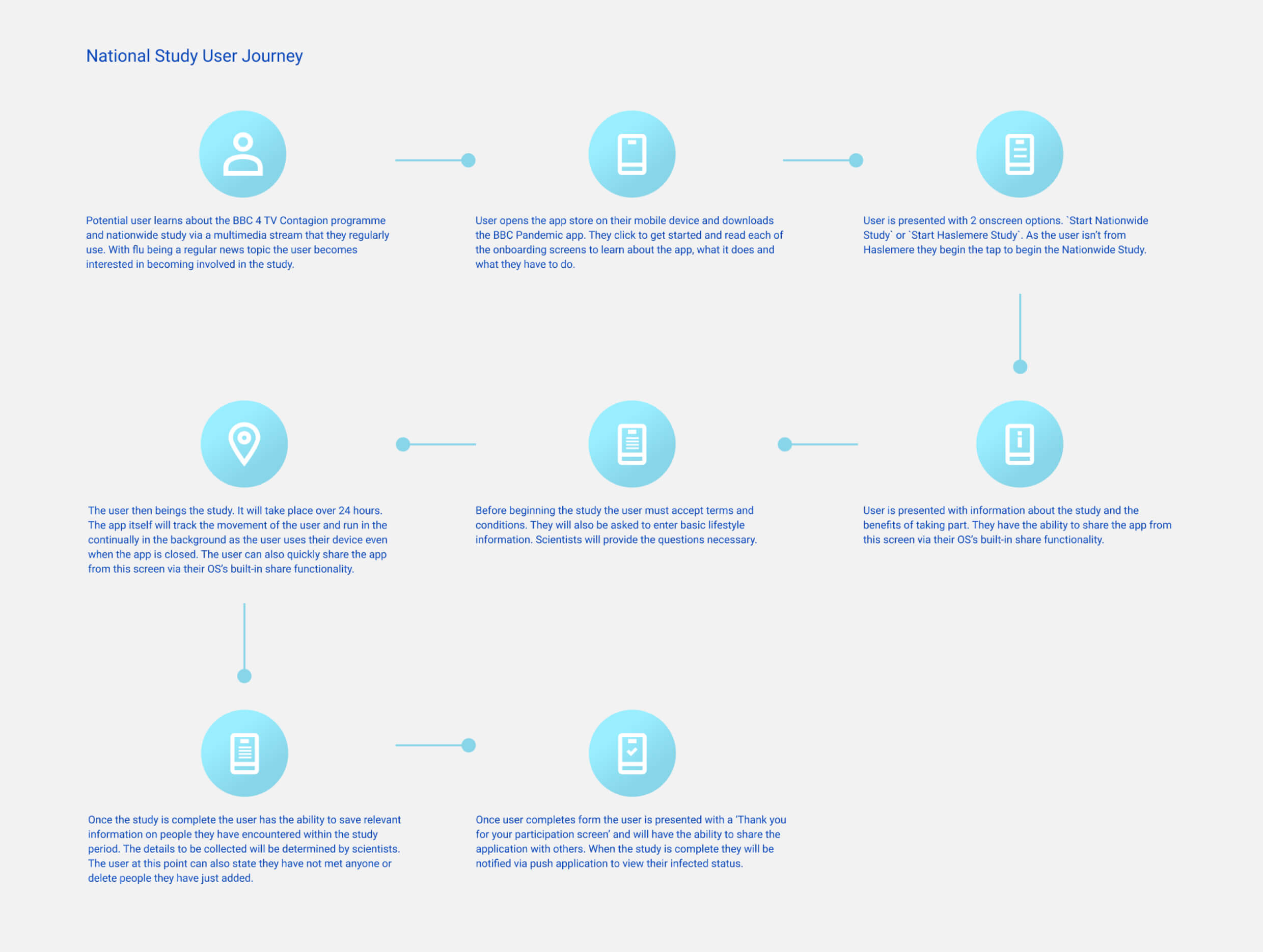
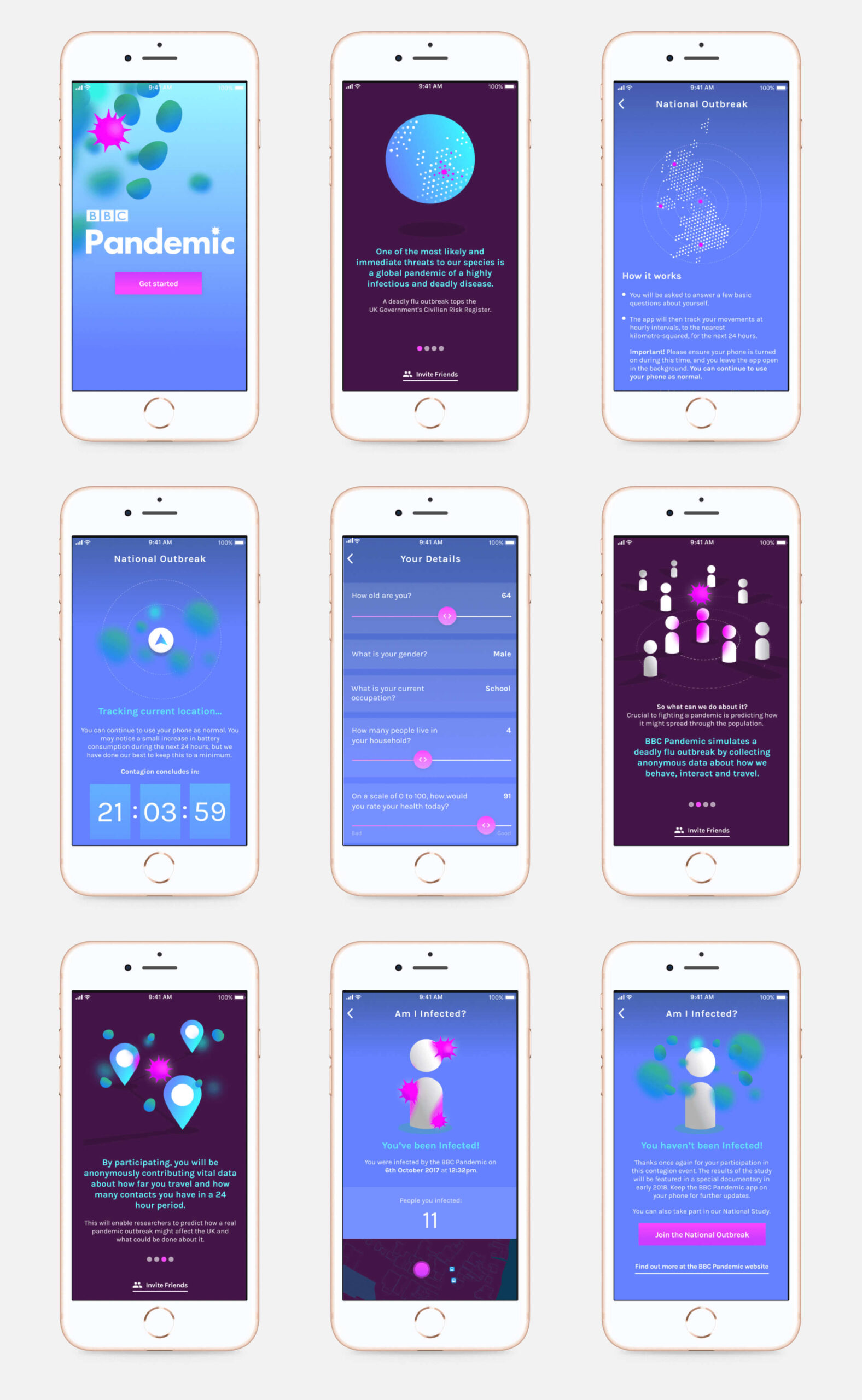
The National Study user journey was structured to drive large-scale engagement while managing consent, privacy, and comprehension for a diverse UK-wide audience.

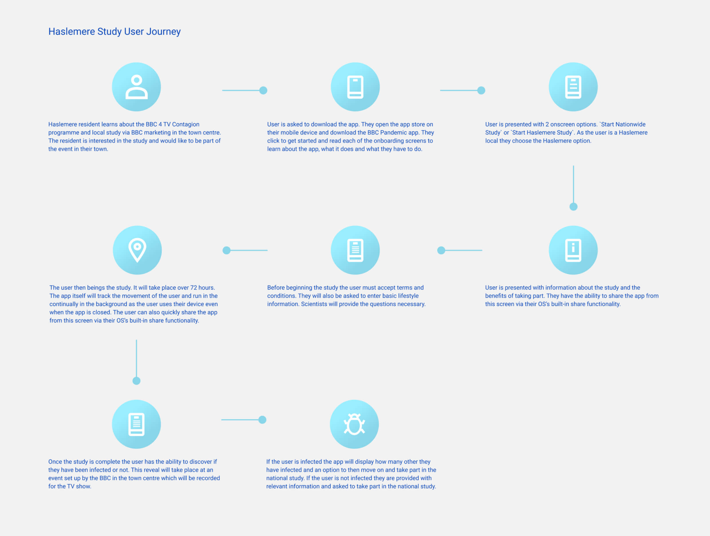
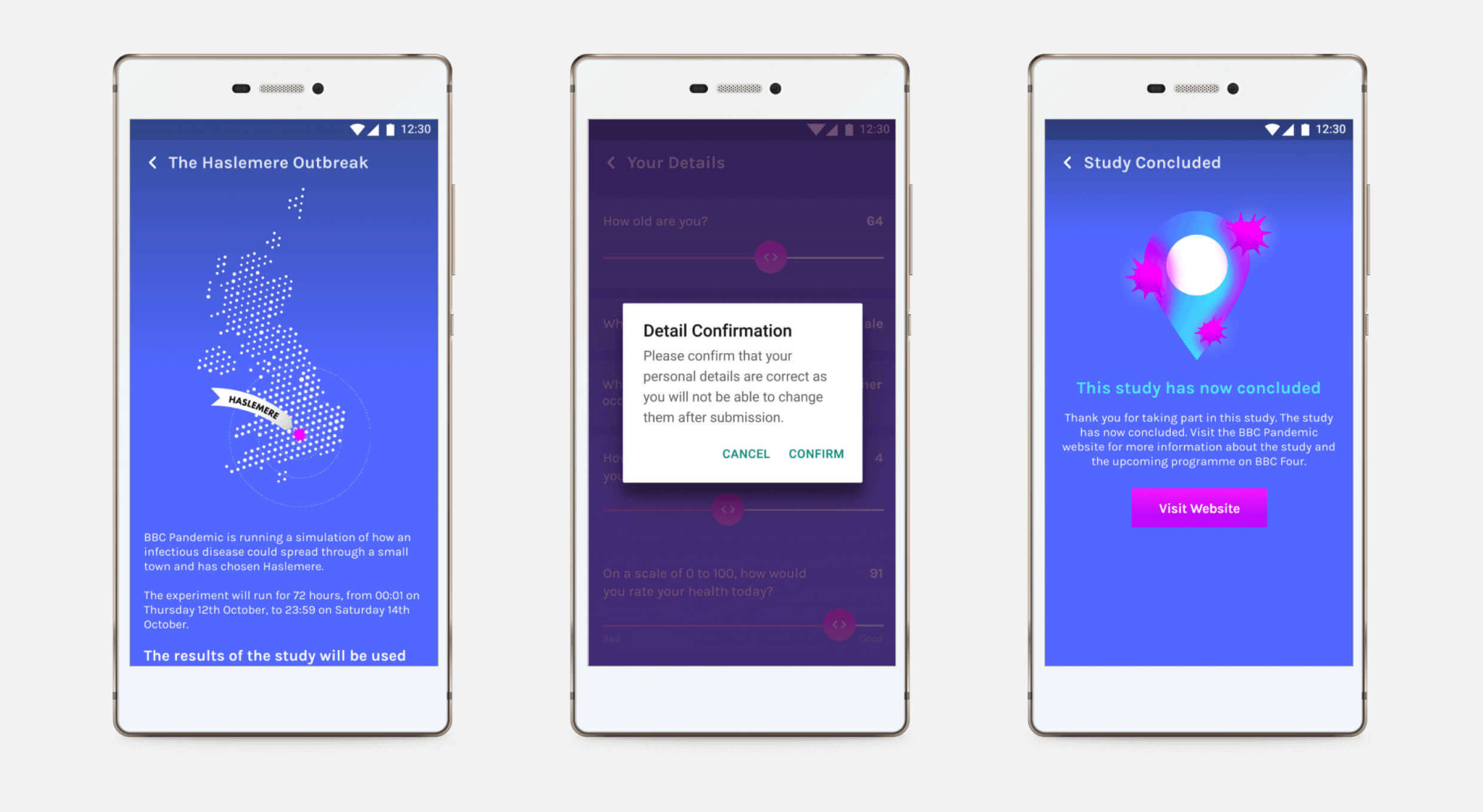
I designed a guided flow for the Haslemere Study to clearly explain each step of participation. The goal was to make data tracking feel purposeful, secure, and easy to follow for a local, non-technical audience.
Wireframing & Prototyping
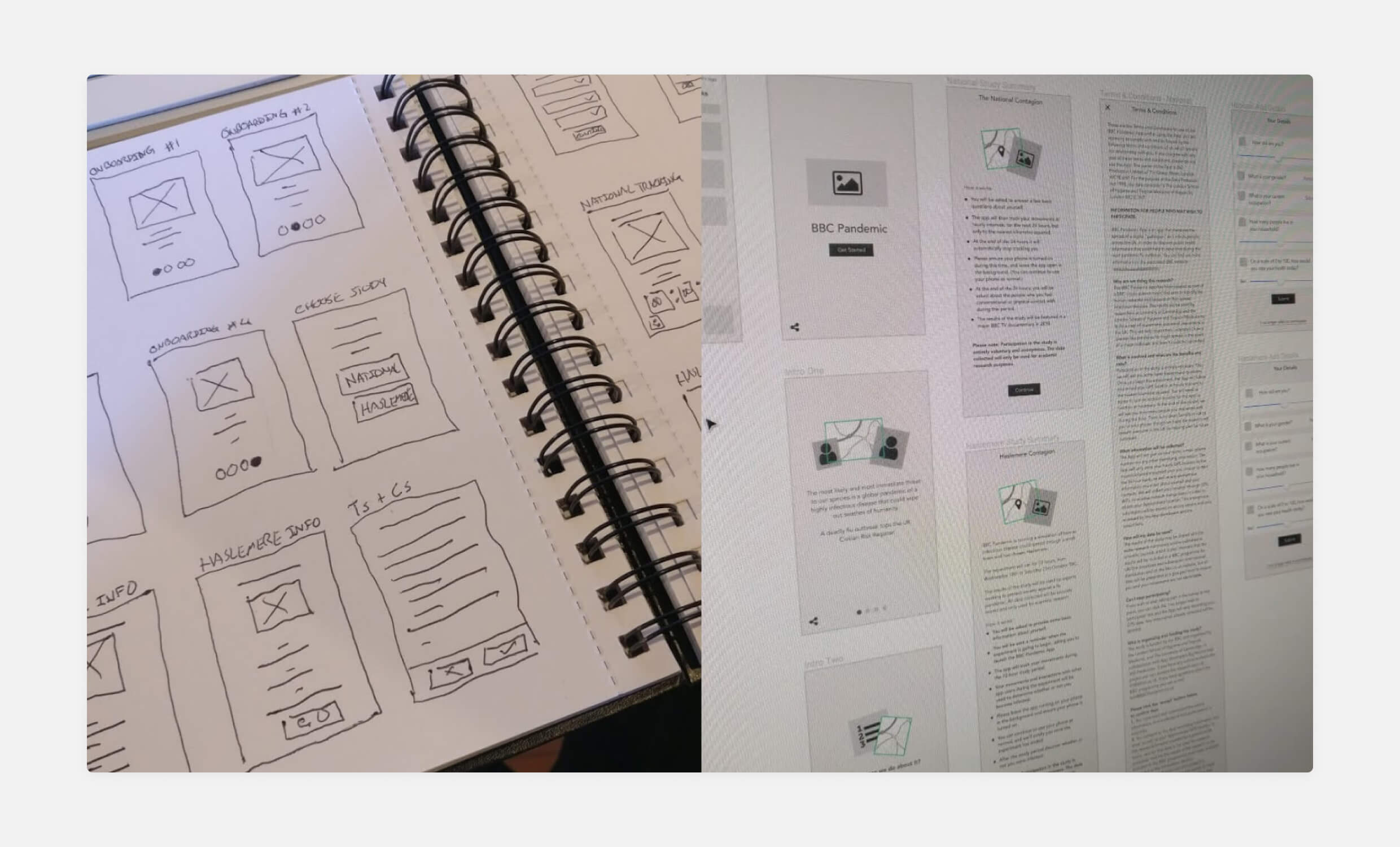
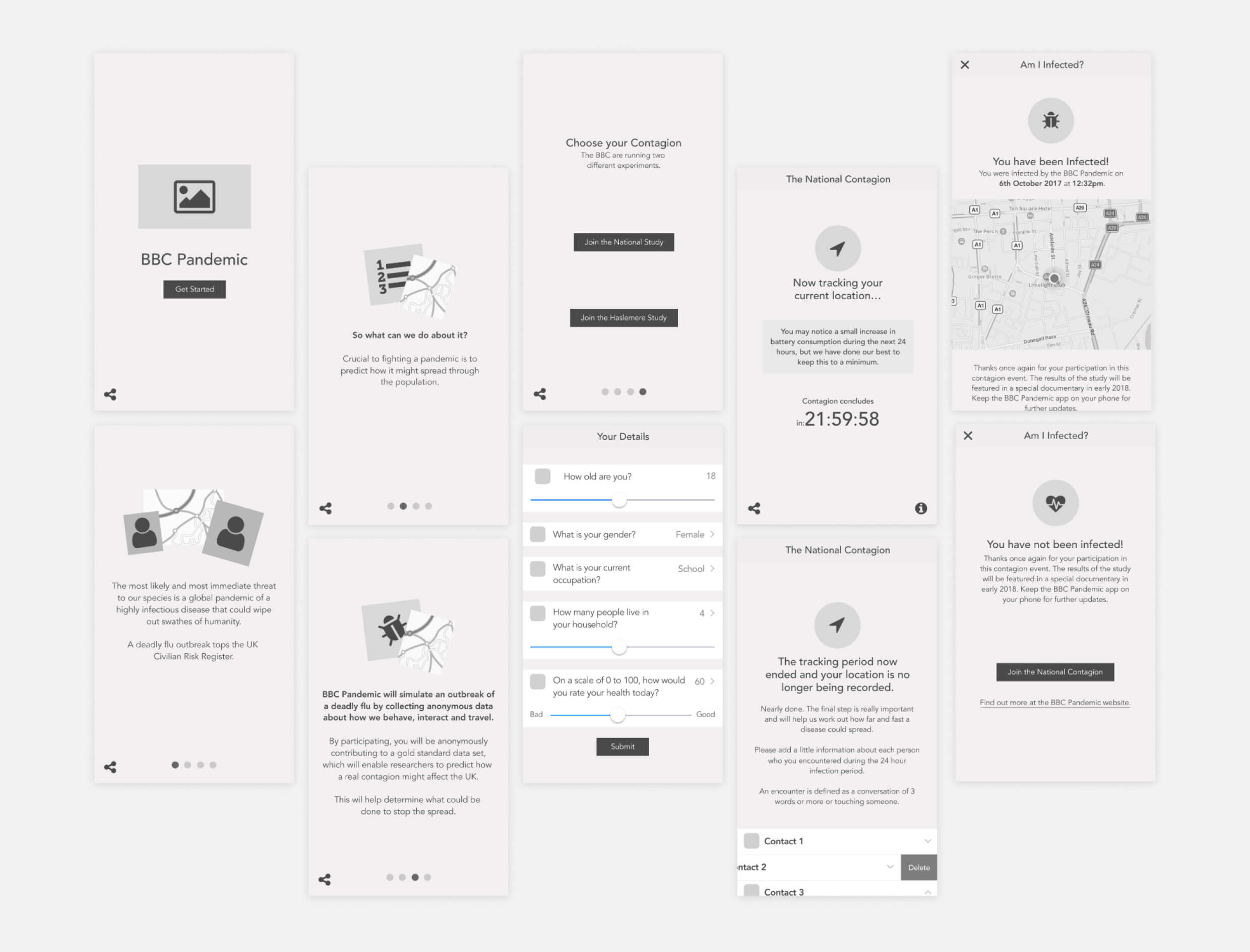
I developed comprehensive Figma wireframes mapping the essential user flow: registration, consent management, location tracking permissions, and results delivery. Each screen balanced scientific data requirements with user comprehension.

I sketched out initial flows to align internal teams and quickly prototype study variations. These early iterations shaped the app’s dual-study model and helped prioritise clarity in key consent screens.
Testing Under Pressure
Tight time constraints meant we didn’t get that immediate “aha moment” in initial testing that you’d typically want. However, when we ran the localised Haslemere study and received the data back, it was a breakthrough moment. We knew the approach would work for the wider national study. This pilot became our validation strategy, compensating for limited early-stage user testing.

Early design prototypes balanced scientific requirements with user comprehension. I crafted clear onboarding and consent flows that helped users understand their role in the study without being overwhelmed by complexity.
UI Design & Technical Solutions
Working within BBC’s brand framework, I created an experience that felt both authoritative and approachable across diverse user groups with varying technical comfort levels.
Age-Inclusive Design
For older age groups, I prioritised comprehension over visual sophistication:
- Clear Typography: Legible fonts and high-contrast form fields reduced barriers
- Simple Inputs: Streamlined interaction patterns, even when forms were necessarily extensive
- Plain Language: Made text easy to understand across all technical proficiency levels
Platform Optimisation with Constraints
The app needed to run continuously to collect data effectively, creating significant technical constraints:
- Battery Optimisation: Designed and developed specifically to prevent battery drain during background tracking
- Native Patterns: Used platform-specific navigation to reduce cognitive load during data entry

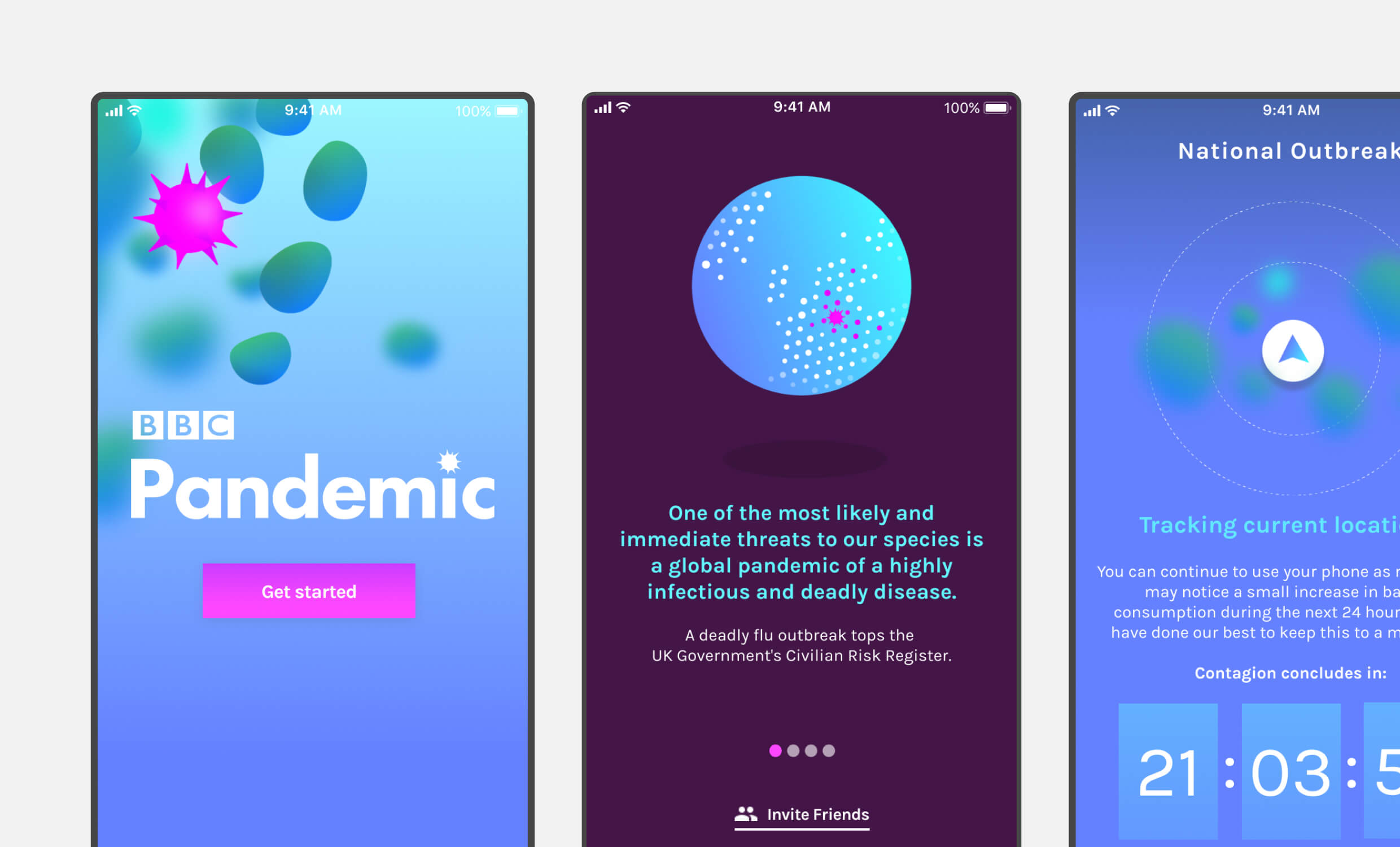
Final iOS designs used platform-native components to create a fluid, familiar experience across onboarding, data entry, and result screens. I combined native patterns with visual storytelling to make participation feel personal, urgent, and intuitive.
Key Constraints & Strategic Trade-offs
Scientific Requirements vs. UX Best Practices
One of the most challenging aspects was the tension between scientific rigor and optimal user experience. The research team had specific data requirements that couldn’t be compromised, and with tight timelines, some forms weren’t as optimized as I would have preferred. This created a strategic design challenge: how do you balance academic standards with usability when you can’t fully optimize every interaction?
My approach was to focus optimisation efforts on the most critical user paths while ensuring that even lengthy, scientifically-required forms remained accessible through clear typography and simple interaction patterns.
Data Collection & Trust Building
Detailed hourly location logs were often a sticking point. I addressed this by clearly explaining how GPS data would be anonymised and aggregated, optimising background tracking to minimise battery impact, and using timely push notifications for contact list completion and daily check-ins without intrusion.
Managing Public Reception
Media impact didn’t create significant operational challenges. While we received some negative feedback in app stores, this was expected given the sensitive nature of location tracking. The ultimate goal of gathering enough quality data for epidemiological modelling was successfully achieved, demonstrating that clear communication about research value can overcome initial scepticism.
Development & Quality Assurance
Working with an external development team shipping nightly builds, I took on QA responsibilities including user flows, data integrity testing, and edge case management, tracked through spreadsheets and Jira to maintain rapid iteration cycles.

Designed with native Android components, the UI ensured consistency, legibility, and low cognitive load across a wide demographic. I prioritised clarity and accessibility while working within BBC brand guidelines and strict technical constraints.
Outcome & Impact
Within weeks of launch, over 50,000 users completed their studies, shattering initial targets. The app’s success continued with nearly 100,000 participants nationwide within six months, creating one of the most significant citizen-science datasets on flu transmission.
Media coverage included BBC One’s The One Show, The Guardian, Telegraph, and national newspapers. Beyond the Digital DNA App of the Year award, the project demonstrated how strategic UX design can drive widespread participation in sensitive scientific research, even when design constraints limit traditional optimization approaches.
Key Insights
Transparency Trumps Perfection: Clear communication about data collection and privacy measures proved more effective than complex technical assurances, enabling unprecedented public engagement with sensitive health research.
Strategic Pilot Testing: When timeline constraints limit comprehensive testing, a well-designed pilot study can provide crucial validation for broader rollouts.
Constraint-Driven Design: Working within scientific and technical constraints doesn’t preclude good UX. It requires strategic prioritisation and creative problem-solving to balance multiple stakeholder needs.
Personal Takeaways
This project showed me the power of transparency in building trust. When working with sensitive data and tight timelines, it’s not just about clean UX. It’s about honest, reassuring communication. It also taught me that sometimes the best validation isn’t in early testing but in seeing real people meaningfully engage with your work at scale.

