eamli Visual Design
I led the UX/UI design that transformed eamli from a spreadsheet proof of concept into a decision intelligence platform used by government agencies and enterprises for multi-million-pound strategic decisions. Working with data scientists and developers, I focused on making complex predictive algorithms accessible to senior decision-makers who needed clear, actionable insights without technical complexity.
The platform enables organisations to predict and compare future outcomes for critical decisions with decade-long implications, replacing manual scenario planning with automated intelligence.
Key Outcomes:
- Adopted by UK Government Ministry for procurement planning
- Secured IBM collaboration
- Won Digital Innovation of the Year award
My Role & Responsibilities
During the MVP stage, my responsibilities encompassed UX/UI design, research, and stakeholder collaboration. I designed user journeys, created wireframes and interactive prototypes, and collaborated with developers, data scientists, and project managers to ensure technical feasibility. Daily standups and weekly workshops maintained an agile, user-centred approach, while my focus on data clarity and accessibility informed a visual system that was both intuitive and scalable.
Many organisations struggle to make informed decisions due to fragmented or outdated data. eamli’s AI technology addressed this by predicting multiple outcomes and providing proactive insights. However, the existing proof of concept required a streamlined, accessible user experience to engage senior stakeholders in enterprise and government environments.
Without strong UX foundations, even sophisticated AI models can overwhelm users. My priority was designing an interface that made predictive insights immediately actionable and easily comparable across different scenarios
Objectives & Discovery
The primary objective was to create a tangible MVP that balanced AI sophistication with user accessibility. We also aimed to validate our approach by gathering feedback from partner organisations willing to test early versions of the product.
During initial discovery, I conducted informal interviews with internal teams and partner organisations. Early prototypes and user journeys were shared to identify pain points and core requirements: users needed clear, concise data outputs and streamlined workflows for scenario creation. Competitive analysis revealed that most existing solutions relied on manual modelling, making eamli’s automated outcome prediction and visualisation a clear market differentiator.
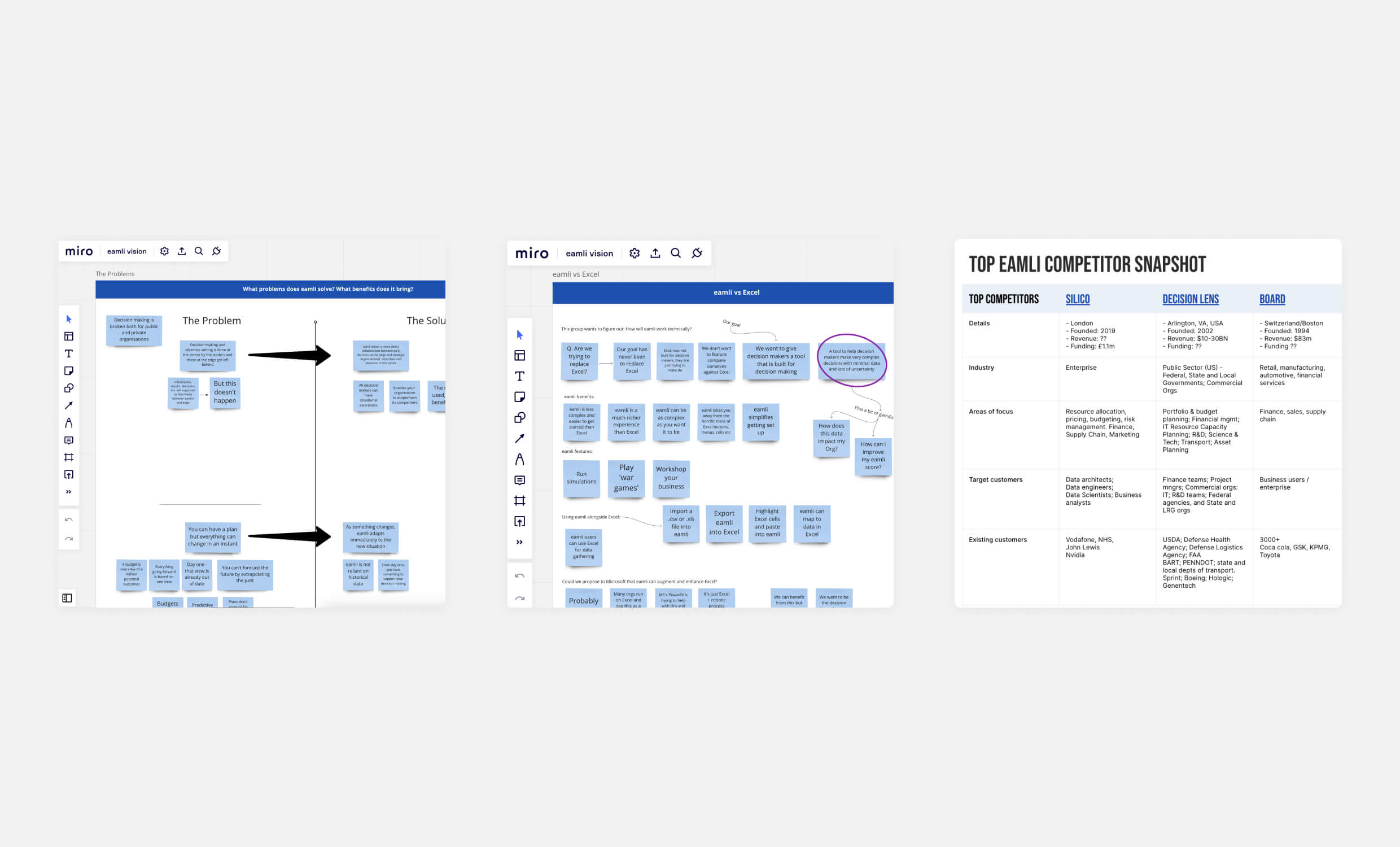
I facilitated collaborative Miro sessions to explore user problems, define solution framing, and evaluate competitors. These sessions helped align the team around a clear product vision.
Product Architecture & Planning
Over four months, we iterated on the MVP, refining its core features:
- Scenario Building & Comparison – Users needed to define business models quickly, adjusting inputs through intuitive workflows rather than complex navigation.
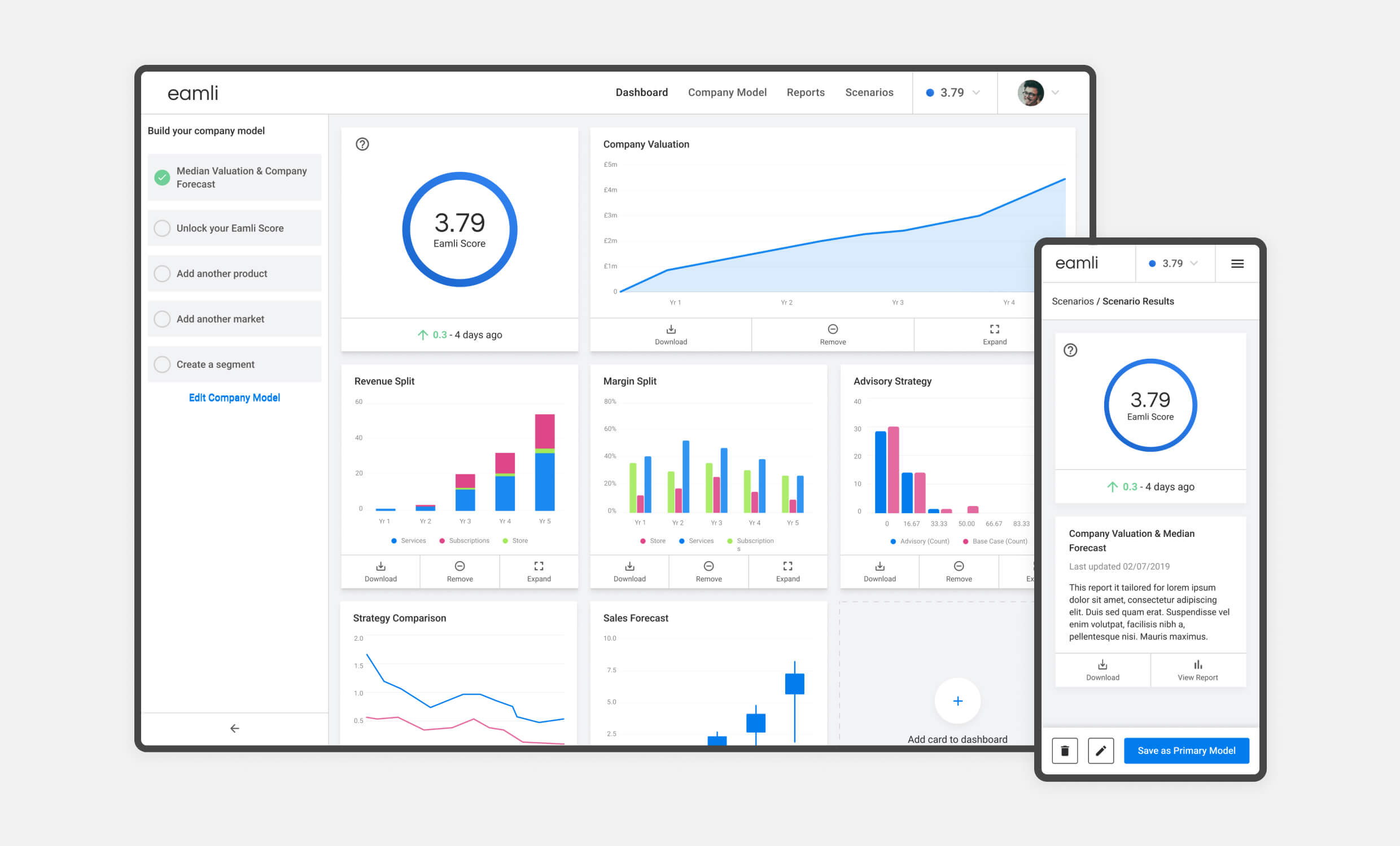
- Data Visualisation & Reporting – Clear charts, graphs, and scorecards enabled stakeholders to instantly assess potential outcomes for each scenario.
- Organisation Management – Teams required functionality to manage multiple decision-makers and datasets within a unified platform.
Throughout this phase, I worked closely with data scientists to understand the backend capabilities. Since the underlying logic could handle diverse company structures and data types, I designed a modular UI that could accommodate custom data inputs while maintaining user clarity and simplicity.
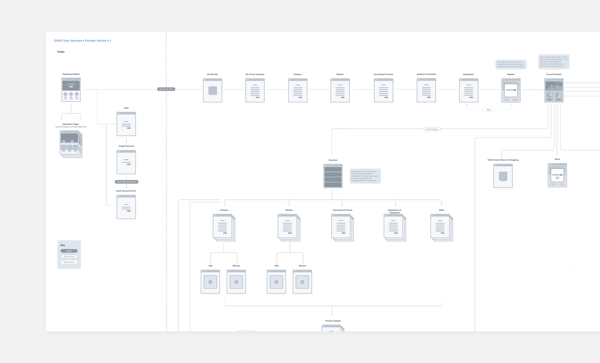
Early user journey mapping helped align technical logic with real-world workflows, ensuring the platform would support intuitive navigation from onboarding through to scenario comparison.
Wireframing & Prototyping
Using Figma for wireframing and interactive prototypes, I shared multiple iterations with internal and external stakeholders. Each testing session combined task-based evaluations such as “create a new scenario and compare it to an existing one” with broader discussions about navigation and overall usability.
These sessions validated our minimalist approach to data visualisation. However, participants requested faster methods for comparing outcomes and switching between scenarios. This feedback highlighted an opportunity for natural language interactions, which the eamli team pursued in later development phases after my involvement concluded.
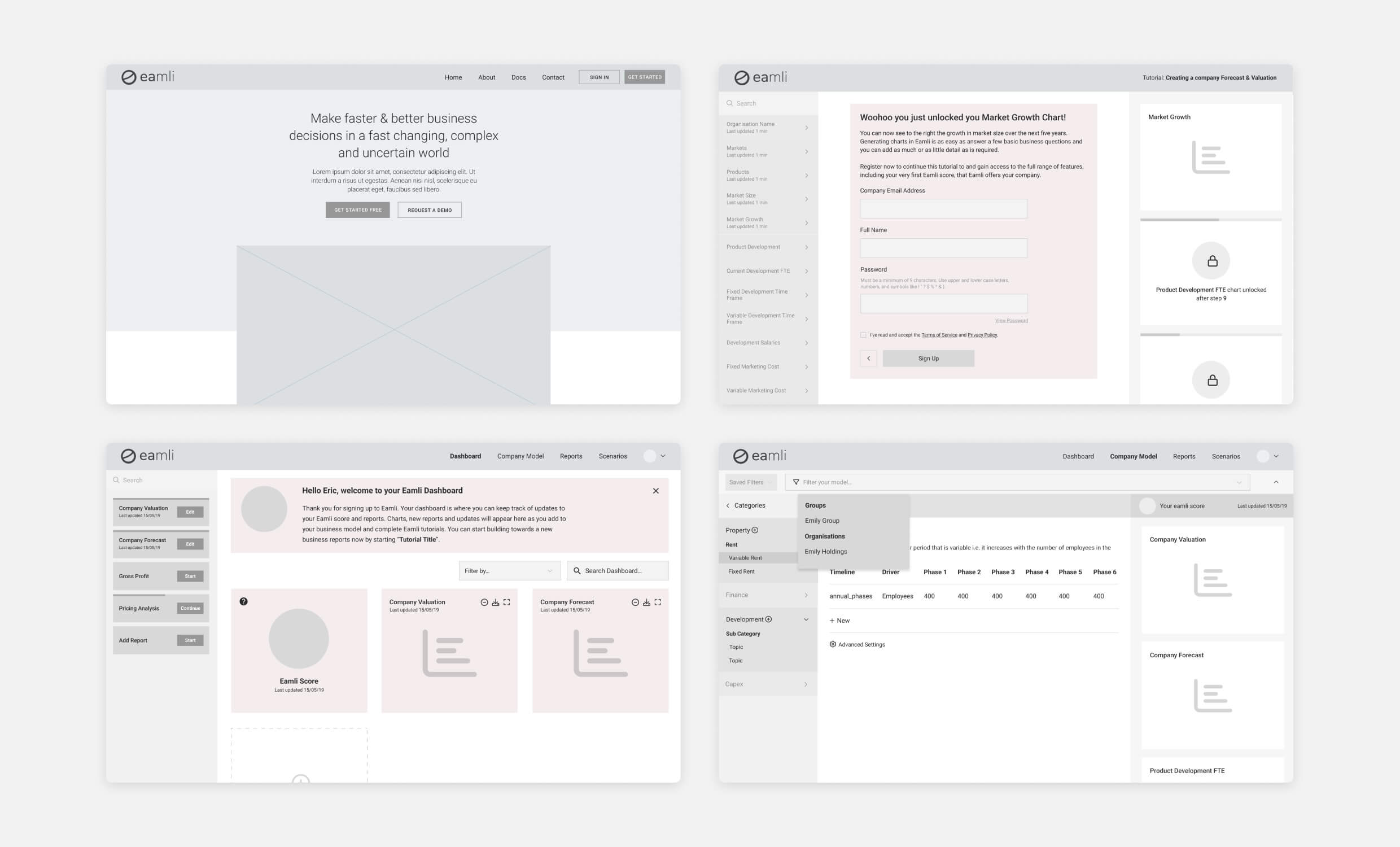
I created and iterated low-fidelity prototypes to quickly test layout and onboarding flows, ensuring we validated core interactions before moving into visual design.
Visual Design & Accessibility
While adhering to foundational brand guidelines, I custom-designed most UI components to accommodate the platform’s data complexity.
To maintain a clean, contemporary aesthetic, each dashboard view minimised visual clutter and prioritised readable data visualisations. I integrated interactive tooltips and contextual guidance to help users discover advanced functionality without cognitive overload.
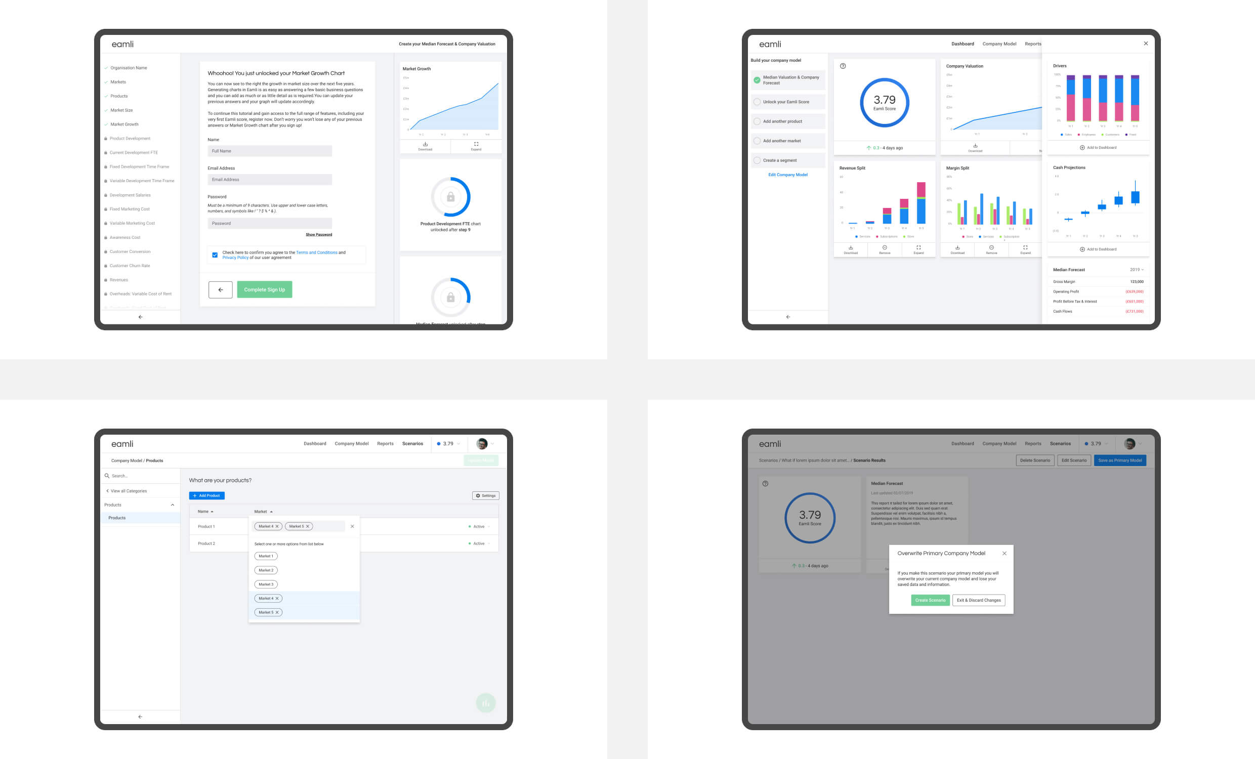
The MVP interface balanced data complexity with visual clarity, enabling senior decision-makers to build company models, compare scenarios, and trust the outputs through accessible and visualised results.
Ensuring AA-level accessibility compliance was essential, particularly for text contrast, colour usage, and interaction patterns. Given the complexity of scenario comparisons involving multiple graphs, metrics, and calculations, we prioritised a desktop-first experience while developing mobile-responsive layouts for stakeholders requiring quick updates remotely.
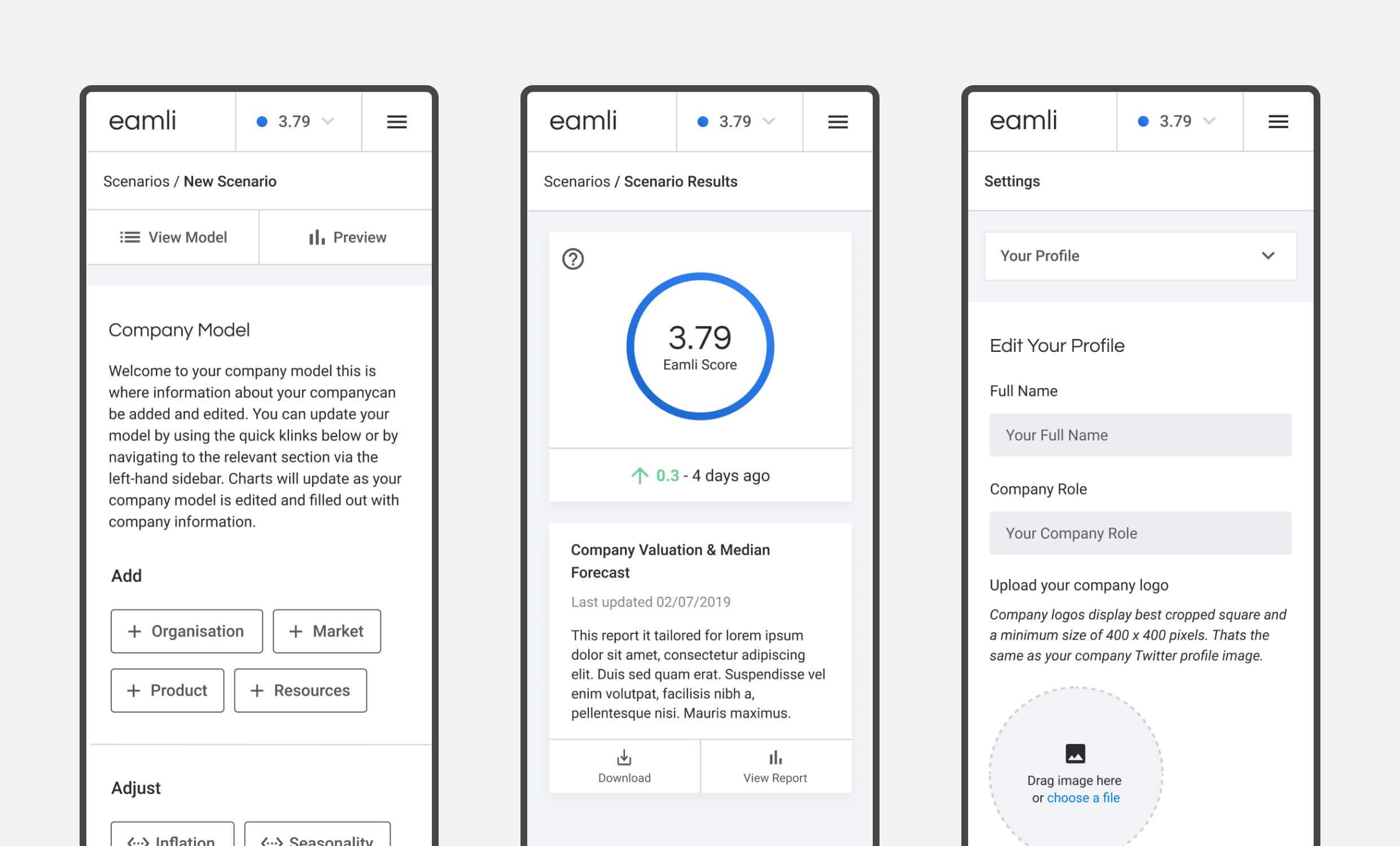
Mobile prototypes were designed to support remote access for stakeholders, focusing on clarity, concise data presentation, and intuitive scenario interactions even on smaller screens.
One significant challenge was translating complex AI modelling into clear, visual summaries. This required extensive collaboration with data scientists to ensure the system’s intelligence remained accessible without oversimplification or technical complexity.
This project marked my first major exploration into data visualisation, reinforcing how iterative testing validates design effectiveness. Integrating user education into the UX through onboarding prompts, tooltips, and contextual guidance proved essential for making AI outputs accessible to non-technical decision-makers.
Outcome & Impact
The breakthrough came during user testing when potential clients immediately grasped the platform’s value, leading directly to UK Government Ministry adoption. This validation proved that complex AI predictions could be made genuinely useful through strategic UX design.
Design Challenges & Solutions
The hardest problem was creating data input workflows that worked across different company structures. Every organisation models their business differently, yet users needed an intuitive way to input and manage their data. While we achieved a version that worked for most use cases, the experience highlighted the complexity of designing truly agnostic enterprise tools, a challenge that continued to be refined after my involvement.
The rapid design and testing cycle, combined with extensive client feedback, was demanding but ultimately delivered the proof of concept needed to secure major partnerships with IBM and government clients, plus Digital Innovation of the Year recognition at the Digital DNA awards.
Key Insight
Enterprise AI tools succeed or fail based on user confidence. Technical sophistication means nothing if decision-makers can’t quickly understand and trust the outputs. This project reinforced that the UX layer isn’t just interface design, it’s what makes advanced technology commercially viable.
Personal Takeaways
eamli pushed me into the deep end of data visualisation and enterprise-scale thinking. I learned the value of designing clarity into complexity, particularly when users don’t have technical expertise but need to make high-stakes decisions. It also reinforced how early prototypes, even if simple, can unlock trust and traction with senior stakeholders.