Shaype Developer Portal MVP Design
I led the UX/UI design that helped transform Shaype’s client developer onboarding from a weeks-long manual process into a self-service platform. Working embedded within Shaype’s team, I designed the branded developer experience that allows enterprise clients to generate API keys, manage team access, and begin integration immediately.
The platform eliminates the bottlenecks that were limiting Shaype’s ability to scale with enterprise clients, replacing fragmented email workflows with a secure, intuitive self-service experience.
Key Outcomes:
- Transformed weeks-long manual setup into immediate self-service onboarding
- Eliminated internal bottlenecks constraining enterprise client growth
- Created reusable design framework for future Shaype product development

My Role & Responsibilities
As embedded UX/UI Designer working directly within Shaype’s product team, I was responsible for the design of their new developer onboarding experience. My work encompassed user research, competitive analysis, user journey design, wireframing, UI design, and close collaboration with development teams to ensure seamless implementation.
Working in weekly sprint cycles, I maintained constant alignment between design decisions and business objectives whilst ensuring the final experience met both enterprise procurement standards and developer usability requirements.
The Challenge
When I joined the project, Shaype had a frustrating contradiction at the heart of their business. They could help enterprises launch sophisticated financial products in 4-6 months – but getting developers set up to even start building took weeks of back-and-forth emails.
The Manual Process Problem:
- New clients submitted API access requests and waited for manual provisioning
- No centralized dashboard for managing keys or team access
- Credentials shared via email with security and tracking concerns
- Internal resources pulled away from product development for routine setup tasks
Strategic Business Impact: This wasn’t just a user experience problem – it was constraining Shaype’s growth. Client satisfaction suffered, deals moved slower, and the manual process made Shaype look amateur compared to competitors like Stripe and Plaid with polished self-service portals.
The Vision: Transform this manual bottleneck into a branded, self-service experience that would serve as the foundation for automating Shaype’s entire client onboarding process.
Discovery & Research
Working with Shaype’s research team, I dove into competitive analysis to understand how developer onboarding worked across the fintech space. Stripe’s elegant simplicity, Plaid’s enterprise focus, Adyen’s comprehensive documentation – each platform had lessons for what enterprise clients expected.
Through stakeholder workshops and interviews, several critical insights emerged:
Developer Experience Requirements:
- Immediate API key generation without manual intervention
- Secure team management capabilities for enterprise development teams
- Granular API access controls configurable by non-technical stakeholders
- Clear documentation and testing capabilities within the platform
Enterprise Client Expectations:
- Professional, branded experience reflecting Shaype’s market positioning
- Security-first approach to credential management and team access
- Scalable architecture supporting complex organisational structures
The challenge was designing something that worked for both the hands-on developer who just wanted to test an API and the enterprise administrator managing a team of twenty engineers across different projects.

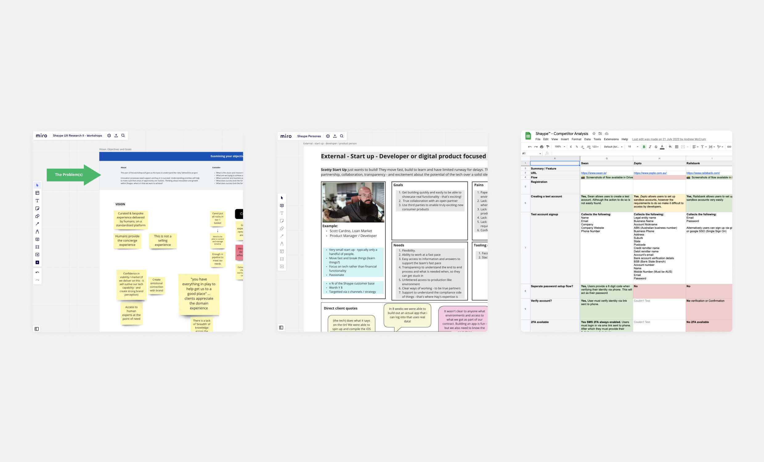
I led early discovery using Miro workshops, persona mapping, and competitor analysis to identify the friction points in Shaype’s manual onboarding and define the expectations of enterprise developers.
From Manual Workflows to Self-Service Design
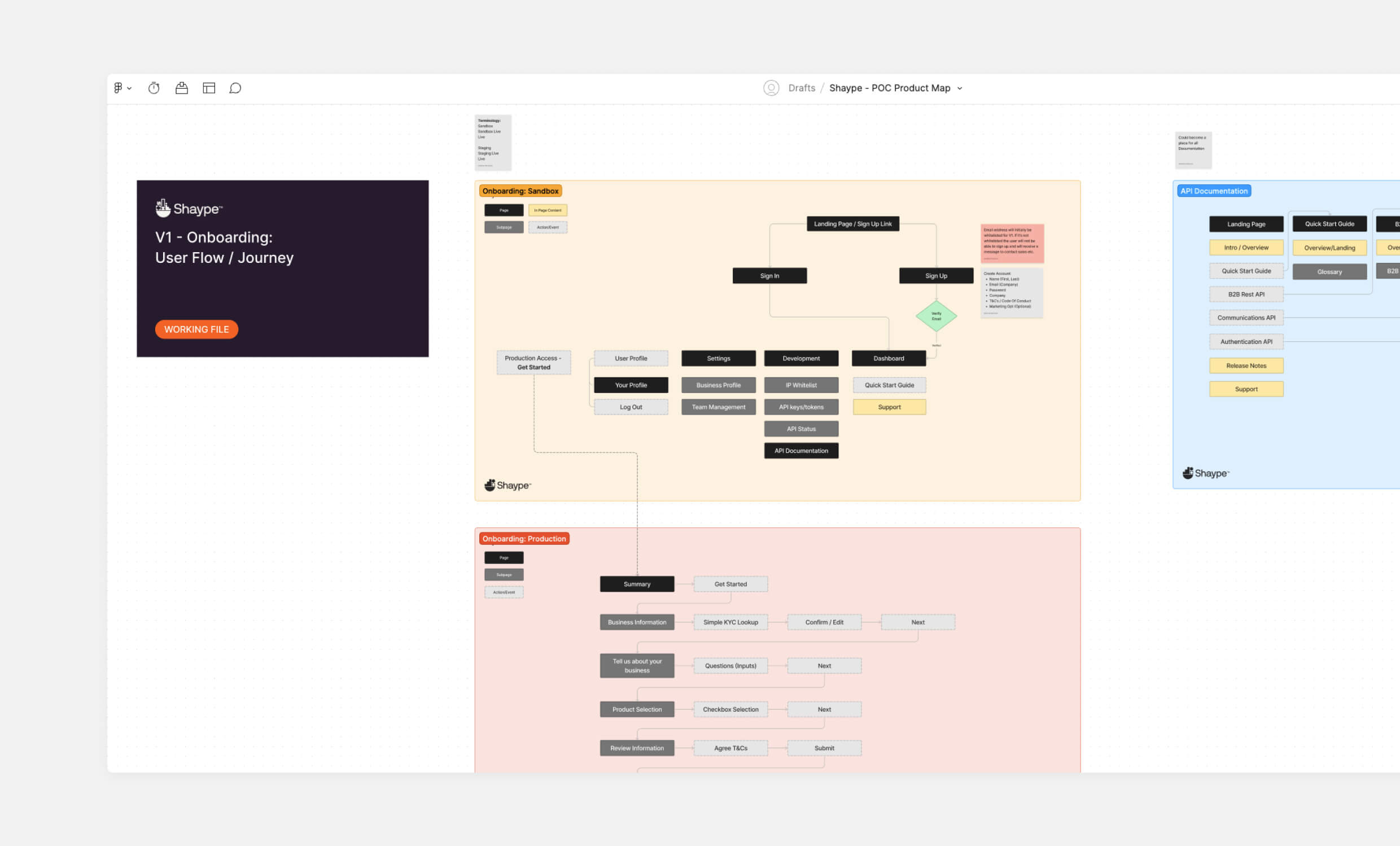
I started by mapping out the existing manual workflow to understand exactly what needed to be automated. The breakthrough was realising we needed to design for two distinct but connected experiences: immediate access for individual developers, and comprehensive management tools for enterprise teams.

Mapping the full onboarding architecture helped align product and engineering around a two-tiered experience. One for individual developers and one for enterprise team management, forming the foundation for scalable, self-service access.
This dual approach shaped three core design areas:
Core User Flow Architecture: Working with Shaype’s backend team, I designed flows that could generate API keys instantly whilst maintaining enterprise security standards. The platform needed to support multiple user types – from hands-on developers requiring immediate access to enterprise administrators managing complex team permissions.
Security-First Self-Service: API keys remained hidden by default with explicit user actions required for visibility. Clear visual feedback for every security action ensured users understood what was happening without overwhelming them with technical details.
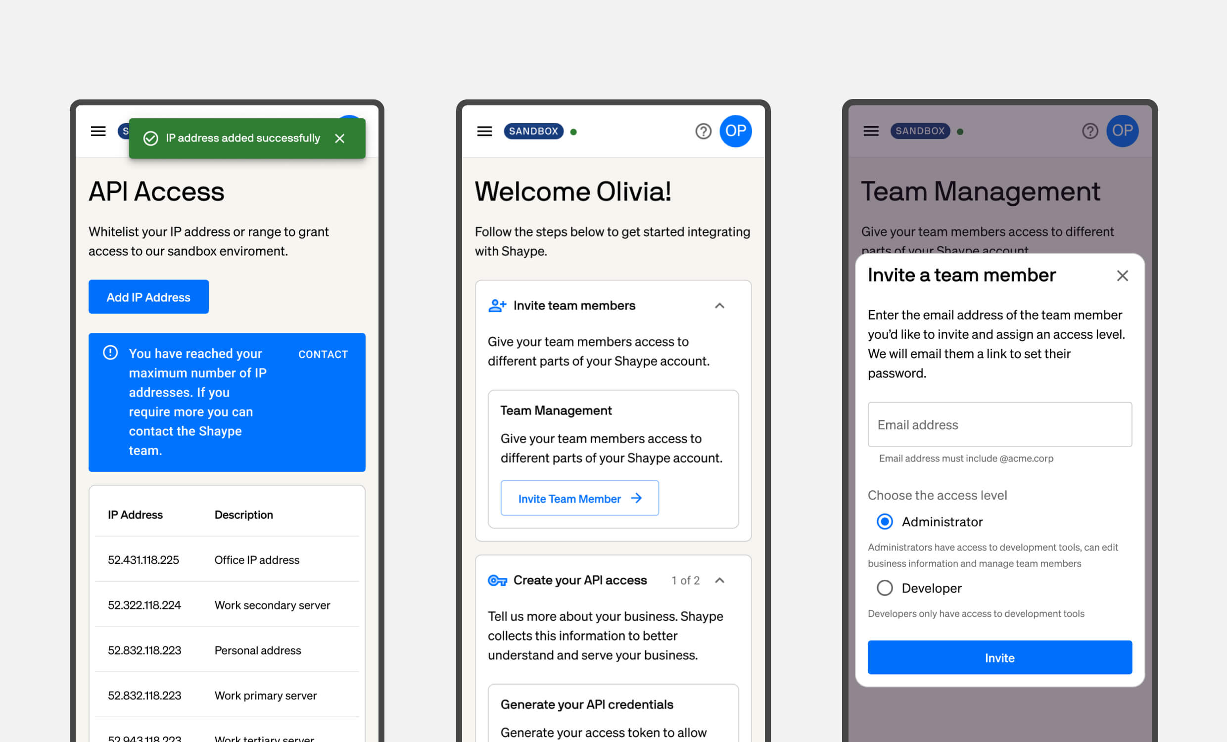
Team Management & Collaboration: A complete invite workflow allowed authorised users to onboard team members via email, with granular permission controls that supported enterprise requirements for role-based access management across multiple projects.

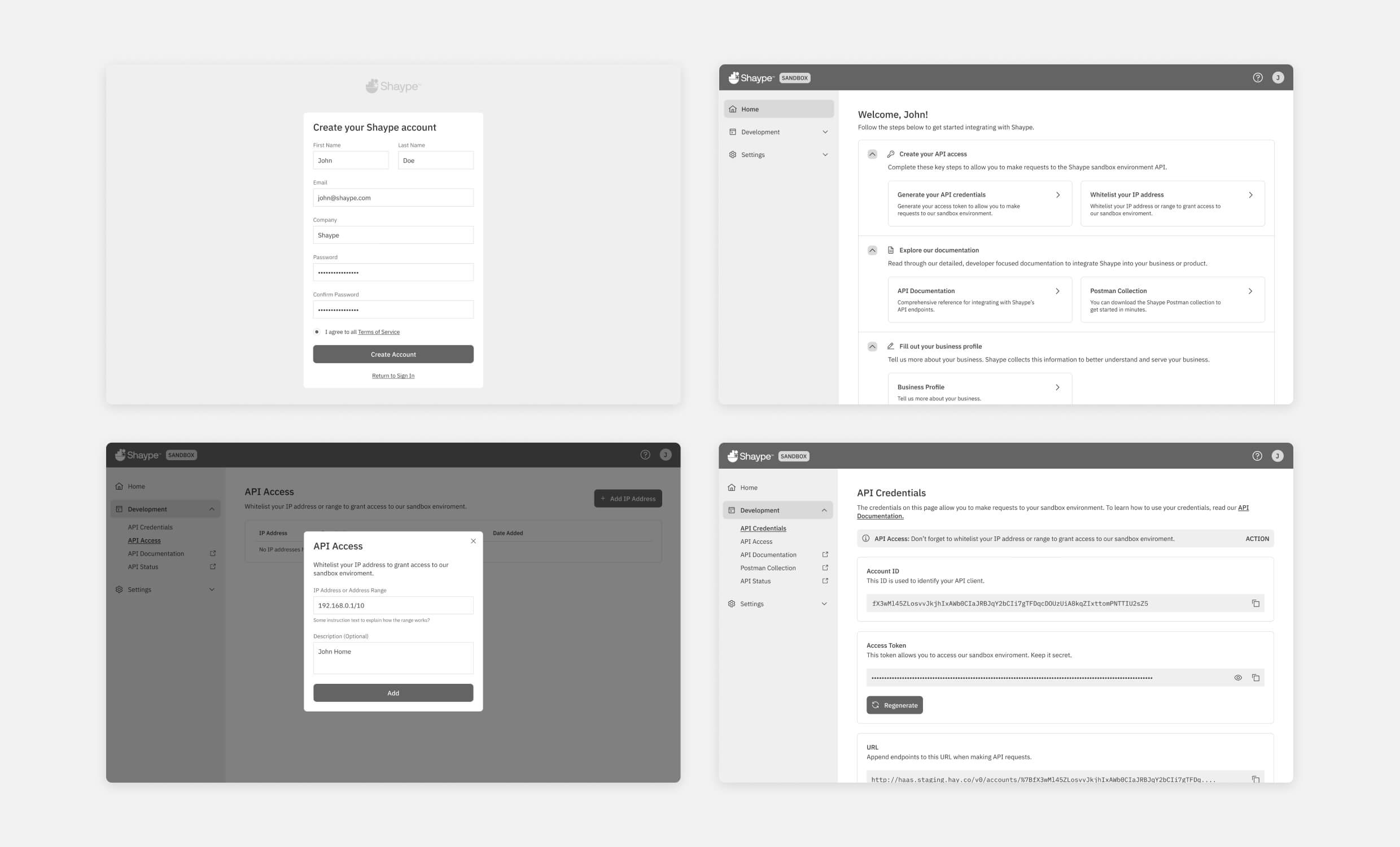
I helped to design low-fidelity prototypes to test the complete registration, API access, and credential management workflows. These screens helped validate the shift from email-driven setup to automated self-service onboarding.
UI Design & Brand Positioning
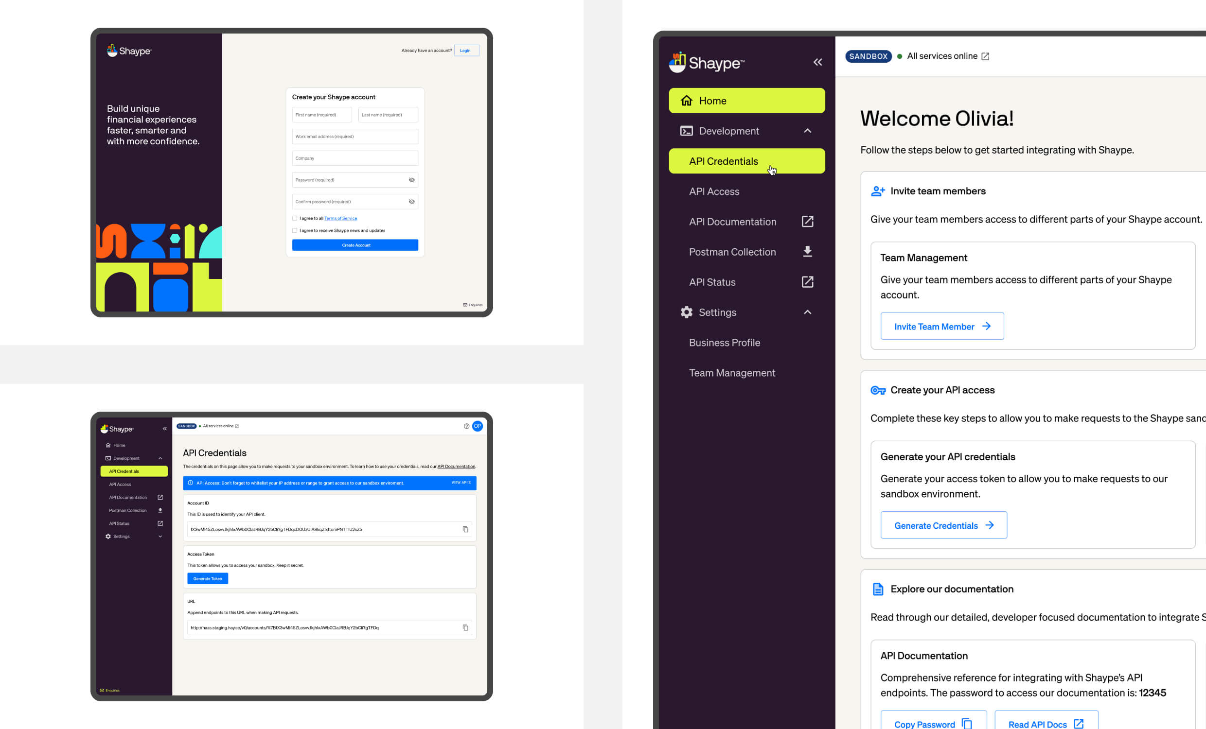
Using Google Material Design as the foundation gave us flexibility whilst ensuring consistency. I customised components to match Shaype’s brand guidelines, creating an interface that felt distinctly Shaype whilst remaining intuitive for developers familiar with other platforms.
The visual design needed to solve a positioning problem – Shaype was competing against established players with polished interfaces and clear information hierarchies. Every design decision contributed to the overall impression of platform maturity and reliability.
Key Design Decisions:
- Clean, contemporary design patterns that met enterprise procurement expectations
- Intuitive information architecture that organised complex BaaS capabilities without overwhelming new users
- Responsive, accessible implementation that worked across diverse enterprise environments
- Custom component library that maintained brand consistency whilst supporting future scalability

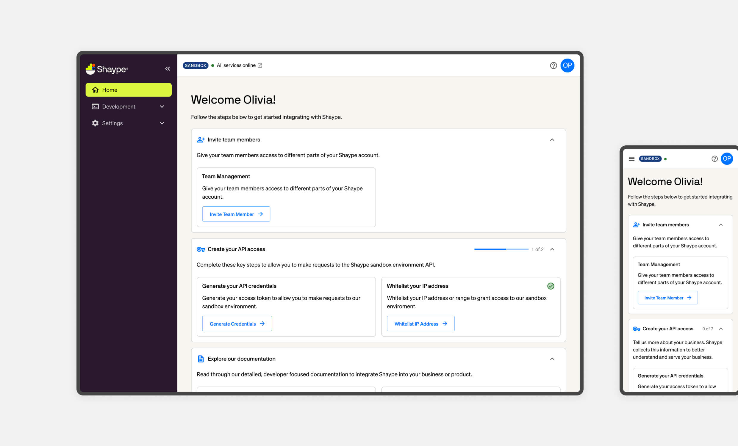
Final UI designs used a customised Material Design system to create a branded, secure interface. Clear visual hierarchy and task-focused layouts ensured developers could generate keys, manage access, and explore documentation with confidence.
Key Design Decisions:
- Clean, contemporary design patterns that met enterprise procurement expectations
- Intuitive information architecture that organised complex BaaS capabilities without overwhelming new users
- Responsive, accessible implementation that worked across diverse enterprise environments
- Custom component library that maintained brand consistency whilst supporting future scalability

I designed responsive layouts to ensure full feature access across devices, enabling developers to complete key actions like API credential generation and team invites from anywhere.
Testing early prototypes with Shaype’s internal teams helped refine the core workflows, with weekly feedback sessions allowing rapid iteration based on real usage patterns rather than assumptions.
Development Collaboration & Implementation
Working closely with Shaype’s development team, I learned to balance design ambition with technical constraints. The backend systems that generated secure credentials had specific requirements that influenced frontend design decisions – rather than fighting these constraints, I used them as creative parameters that actually improved the user experience.
Technical Integration Highlights:
- Detailed design specifications and annotated user flows for seamless handoff
- Edge case planning for expired API keys, permission conflicts, and system maintenance scenarios
- Cross-device compatibility testing across modern browsers and restrictive corporate environments
- Ongoing UX QA throughout development to ensure design fidelity and functional accuracy
The collaboration was particularly important for scenarios that don’t appear in initial wireframes but determine whether users trust the platform in real-world usage.

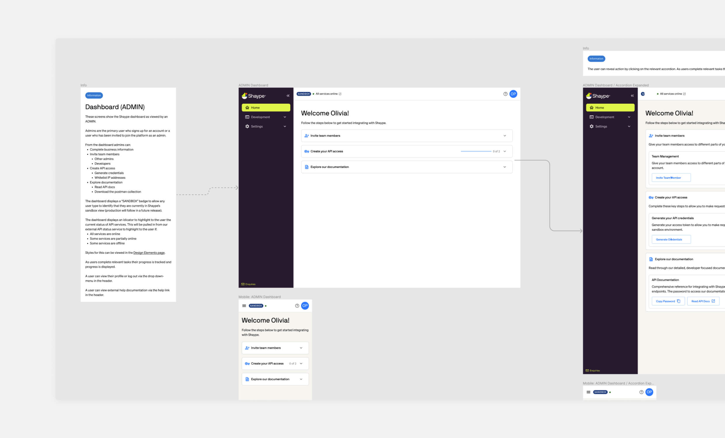
I documented dashboard logic and admin-specific functionality to support implementation and QA. These specs ensured edge cases like API expiration, invite flows, and permission errors were fully accounted for.
The Breakthrough Moment
The real validation came during stakeholder demos when everything finally worked together. Watching API key generation, team invitations, and permission management function seamlessly, stakeholders immediately grasped how this would transform their client relationships. The manual bottleneck that had been constraining growth was simply gone.
What struck me most was seeing Shaype’s team realize they could finally compete on equal footing with established platforms. The professional interface and smooth workflows demonstrated that sophisticated BaaS capabilities didn’t have to come with clunky developer experiences.
Key Design Insights
Self-Service as Competitive Advantage:
In the BaaS space, developer experience directly impacts client satisfaction and operational efficiency. Transforming manual processes into elegant self-service flows became a strategic differentiator that enabled Shaype’s core value proposition.
Security Through Design:
Enterprise financial services require security-first thinking embedded in UX patterns, not added as an afterthought. Designing secure workflows that felt intuitive rather than restrictive was crucial for adoption.
Brand Positioning Through Experience:
For enterprise clients evaluating BaaS platforms, the developer portal becomes a key touchpoint for assessing platform maturity. Visual sophistication and interaction design directly influence purchasing decisions.
Personal Takeaways
This project reinforced how UX design can directly enable business strategy. By transforming operational bottlenecks into scalable experiences, design becomes a revenue enabler rather than just a user satisfaction driver.
Working embedded within Shaype’s team demonstrated the value of understanding technical constraints and security requirements – not as limitations, but as design parameters that can actually improve the final experience. The work established my expertise in fintech UX, particularly in designing developer tools that balance enterprise security requirements with modern usability expectations.

