The Challenge
Classified environments needed collaboration platforms that could be deployed in complete isolation – locally, online, or on any host infrastructure – while maintaining usability across decades of hardware diversity. Our objective was creating a platform agnostic enough to run anywhere while flexible enough for unlimited customisation.
Critical challenges included:
- Infrastructure Agnostic Design: Building for any deployment environment from local servers to cloud hosting
- Legacy Hardware Compatibility: Ensuring usability on everything from old government machines to modern devices
- Complete Visual Customisation: Designing for unlimited colour schemes while maintaining accessibility compliance
- Rapid Development Under Constraints: Delivering weekly releases with no access to real deployment environments for testing
- Isolated Installation Architecture: Each deployment had to be completely separate with zero shared infrastructure
Why It Mattered
Classified environments couldn’t use standard SaaS collaboration tools due to data sovereignty and security isolation requirements. Healthcare organisations, government departments, and financial institutions needed platforms that could be deployed entirely within their own infrastructure – with zero external dependencies or shared resources.
Existing solutions either compromised on security by requiring cloud connectivity, or were so restrictive they hindered actual collaboration. Shift addressed this gap by offering complete deployment flexibility whilst maintaining the collaborative features teams needed, all within environments that never touched external servers.
Defining the Vision
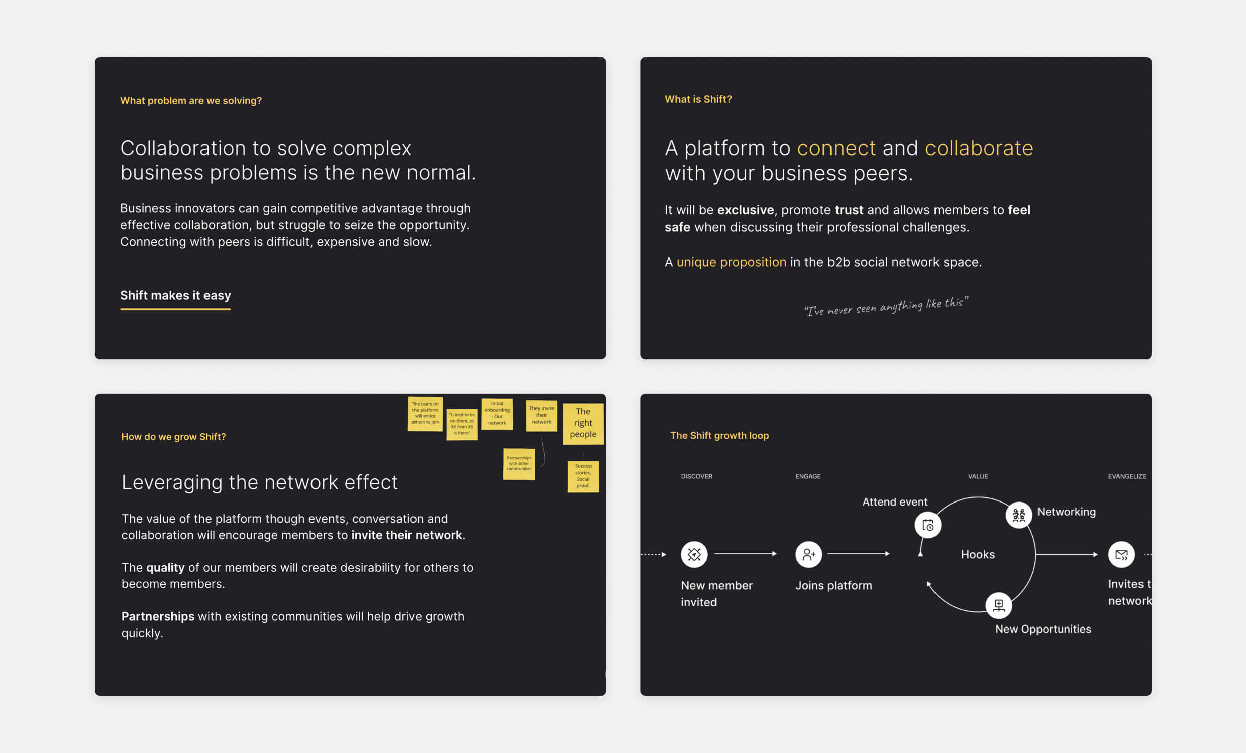
Working closely with our Design Lead and key stakeholders, I helped define Shift’s vision through collaborative workshops exploring the unique needs of isolated, high-security environments. We established three core principles:
- Infrastructure agnosticism is non-negotiable. The platform had to work identically whether deployed locally, on private clouds, or hybrid environments, without requiring specific hosting configurations.
- Universal compatibility drives adoption. Teams using decade-old hardware alongside modern devices needed identical experiences, ensuring no user was excluded due to technical limitations.
- Complete customisation without compromise. Organisations needed total visual control while maintaining accessibility standards, regardless of their chosen colour schemes or branding requirements.
These principles shaped every design decision, ensuring Shift wasn’t just another collaboration tool, but a platform that could truly adapt to the most restrictive and diverse environments.

I helped define and visualise Shift’s strategic positioning, aligning the design system with our business goals. These vision artifacts communicated how modular, private-by-default collaboration could scale across industries and infrastructures.
Research & Early Design Exploration
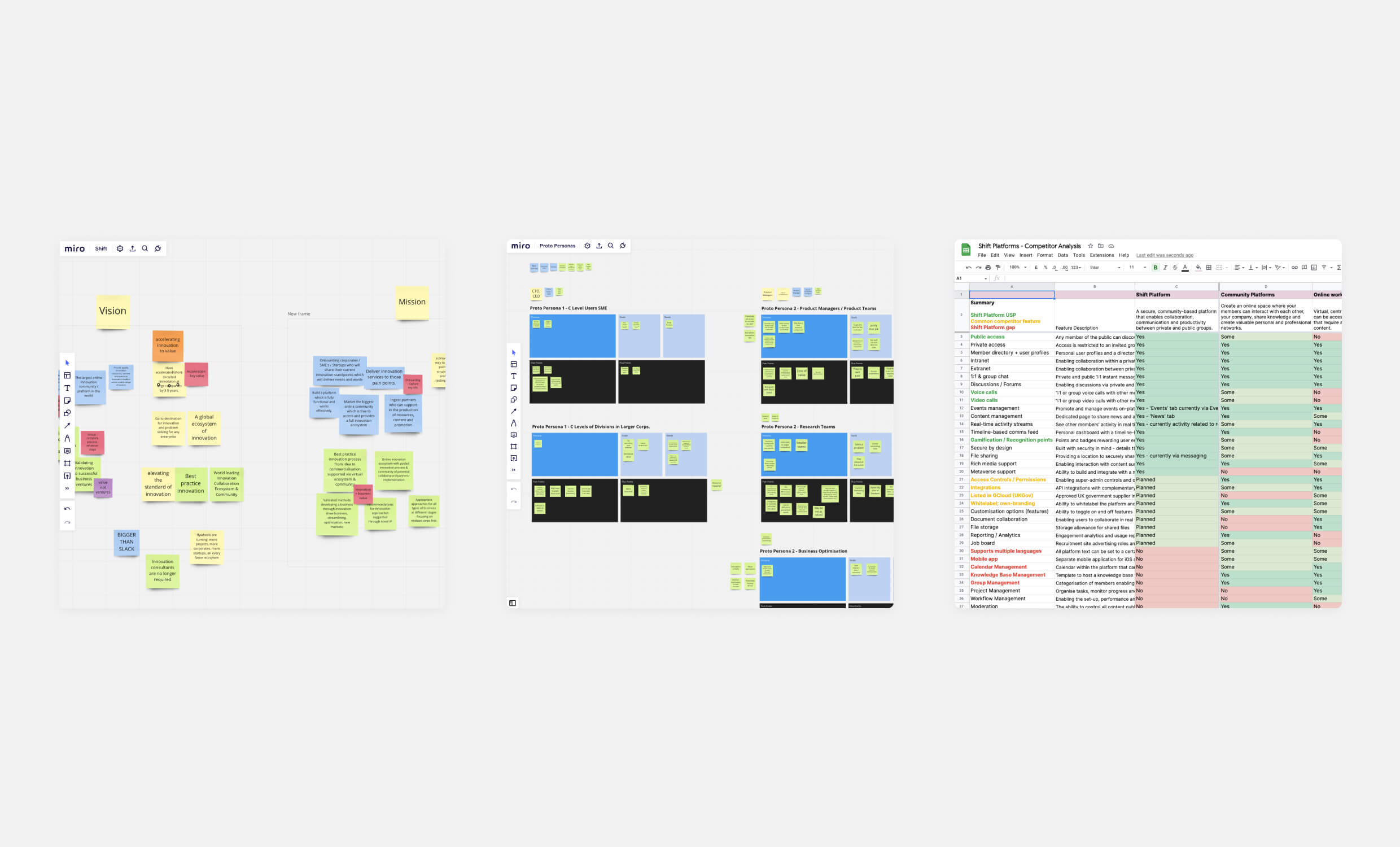
Working without access to actual classified deployment environments presented a unique research challenge. Alongside our researcher, I led competitor analysis and stakeholder interviews across potential sectors – healthcare, government, and finance – to understand the constraints of isolated, high-security environments.
Through these sessions, critical insights emerged that shaped Shift’s direction. Organisations needed granular permission controls that could be configured for different security clearance levels. Legacy hardware compatibility wasn’t optional – teams often had decade-old machines running alongside modern devices. Visual customisation requirements went far beyond logos and colours – some environments needed complete interface themes to match existing internal systems.
Most importantly, we discovered that deployment flexibility was the ultimate differentiator. Unlike standard SaaS tools, Shift needed to function identically whether installed on air-gapped local networks, private clouds, or hybrid infrastructures.

I led early discovery and stakeholder alignment sessions using Miro and competitor analysis. These sessions shaped our approach to permission hierarchies, deployment flexibility, and the visual architecture of the platform.
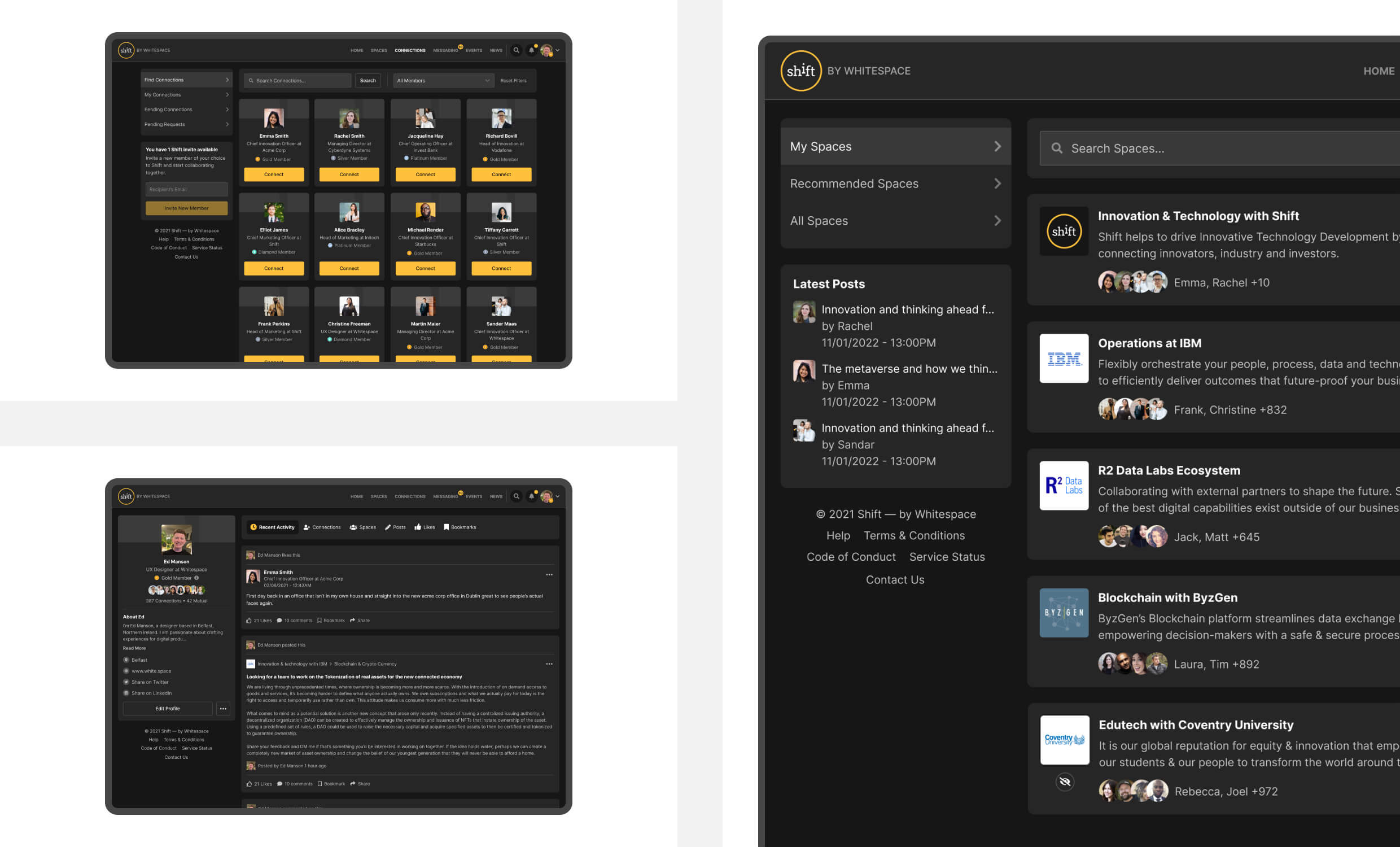
I translated these findings into comprehensive wireframes in Figma, mapping user flows for different deployment scenarios and permission levels. Early prototypes focused on core navigation patterns that would work consistently across any hardware configuration, while building in the foundational architecture for unlimited visual customisation.
Testing these concepts required creative approaches. I worked with internal stakeholders to simulate different organisational structures and security requirements, validating that the information architecture could scale from small teams to enterprise-level deployments without losing usability.
UI Design & Usability Testing
With a solid foundation in place, I led the UI design phase, bringing in additional designers to tackle the complex challenge of creating interfaces that worked across unlimited hardware configurations and visual customisations. The core challenge was building a design system flexible enough for complete rebranding whilst maintaining usability and accessibility standards.
As other designers joined the project, I guided the team through the unique constraints we faced. Legacy hardware compatibility meant every interface element needed to perform well on low-resolution screens and older browsers. Complete visual customisation required designing components that remained functional regardless of colour combinations clients might choose.

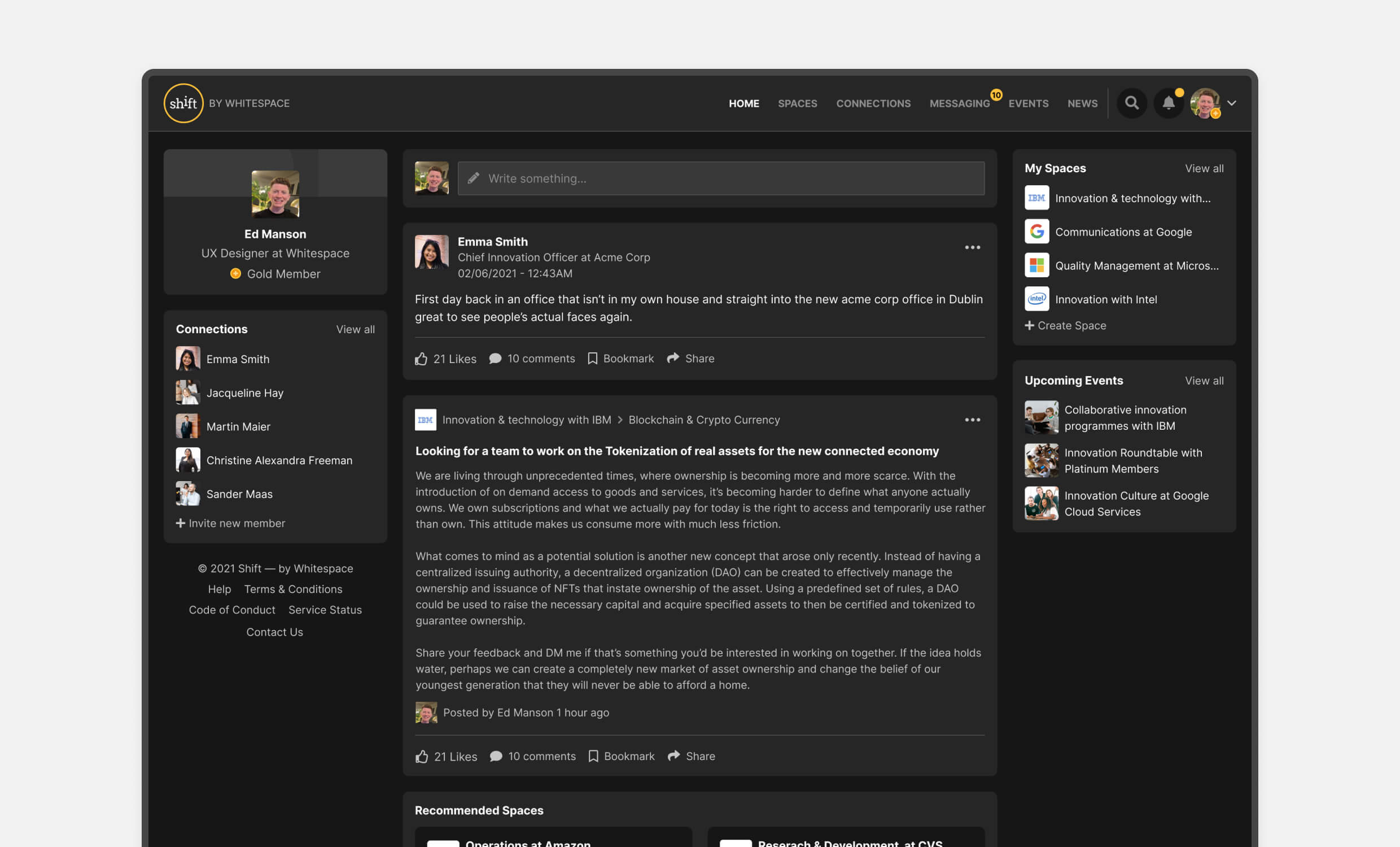
The UI system was designed for modular customisation, supporting completely isolated deployments with organisation-specific branding. Components were built for accessibility, contrast flexibility, and consistent behaviour across legacy and modern environments.
I pushed accessibility compliance as a non-negotiable requirement, knowing that government and healthcare deployments demanded full WCAG standards. This became particularly challenging when designing for unlimited colour customisation – we needed to ensure contrast ratios and usability were maintained even when clients applied their own brand colours.
The design system I developed focused on modular components that could be completely reskinned without breaking functionality. Navigation patterns had to work identically whether deployed on a Windows XP machine or the latest hardware, while maintaining the flexibility for organisations to make the platform feel entirely their own.
Testing & Iteration
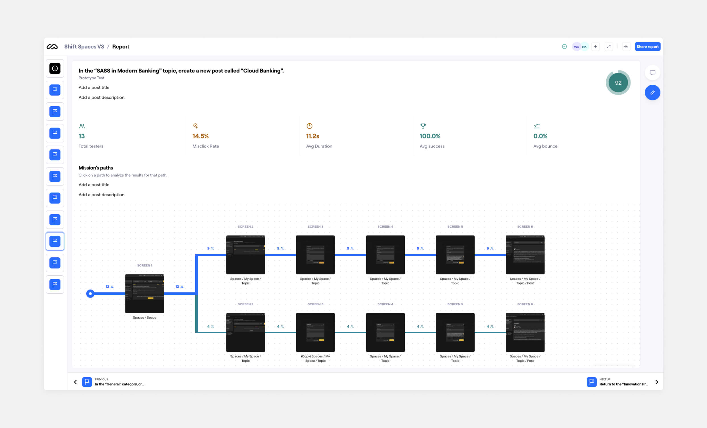
As I developed the high-fidelity designs, I tested them across multiple user groups. Early internal testing provided rapid feedback on usability, while external sessions with potential clients validated Shift’s approach against real-world collaboration needs. I also leveraged Maze for usability testing, allowing us to observe how users navigated the platform and interacted with features.
These tests revealed critical insights that shaped the final design. Navigation needed to be simplified, leading to refinements in menu structure and workspace layout that worked better across our diverse hardware requirements. Most significantly, we discovered the importance of role-based permissions and visibility controls. Users managing large teams needed a way to define who could access certain conversations and files without complexity.

I used Maze to validate user navigation across core flows, capturing success rates and interaction paths. This data informed key changes to simplify content creation and optimise discoverability across constrained deployment setups.
This insight led me to introduce granular admin settings, allowing organisations to manage privacy at a fine level while keeping workflows simple for everyday users. Through iterative design reviews with the development team, I ensured that our ambitious customisation goals remained technically feasible within our weekly release constraints.
Design Leadership & Team Management
I led the bridge between design and development teams across eight months of weekly development cycles. When complex requirements like unlimited customisation with legacy compatibility seemed technically impossible, I guided conversations to find buildable solutions.
My role involved translating ambitious design visions into specifications developers could implement, while ensuring technical constraints didn’t compromise the user experience. This required constant communication and problem-solving to keep both teams aligned.

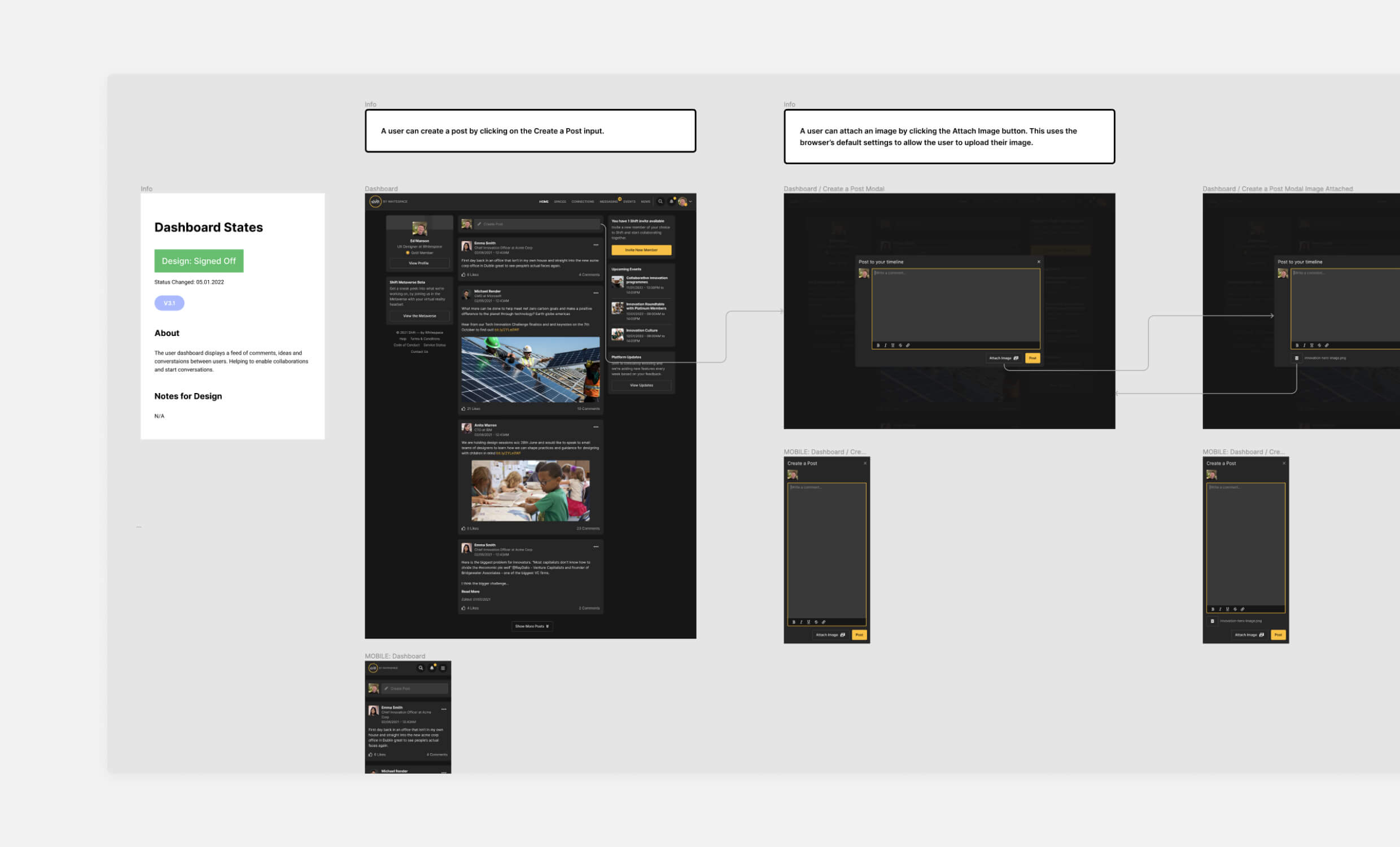
I documented detailed interaction flows to guide developers through platform-specific behaviour and post creation logic. These assets were critical for building consistent UI functionality under strict infrastructure and security constraints.
Mentoring and Team Leadership
As additional designers joined the project, I took responsibility for bringing them up to speed on our unique challenges. Leading junior designers through environments they’d never see, hardware they couldn’t test, and users they couldn’t interview.
I established mentoring frameworks around:
- Designing for uncertainty and unknown constraints
- Building accessibility into component architecture
- Creating flexible design systems that could handle unpredictable customisation
- Developing alternative validation methods when traditional user feedback wasn’t possible
Leading Quality Assurance Processes
I spearheaded design QA processes for software that would be deployed in environments we couldn’t access. Leading systematic build reviews that required checking multiple scenarios and hardware configurations.
Under my guidance, we established protocols that could catch potential issues before deployment to classified environments where fixes would be nearly impossible. I worked directly with the development team to ensure design specifications translated correctly into functioning software across all target environments.
Key Constraints & Strategic Trade-offs
The challenges of designing Shift were unlike anything most product teams face. Building collaboration software for air-gapped government networks without seeing deployment environments. Designing for users we couldn’t interview in classified facilities we couldn’t access.
Designing for Environments We Couldn’t Access
One wrong assumption about legacy browser compatibility could kill an entire installation. The solution? Build redundant compatibility layers and modular architecture that could adapt to infrastructure we’d never encountered.
Designing for Users We Couldn’t Interview
Traditional user research wasn’t possible in classified environments. This meant developing alternative validation methods through stakeholder simulations and creating design systems robust enough for unpredictable use cases.
Making Accessibility Work with Client Branding We’d Never See
Clients could apply any colour scheme – including combinations that would break WCAG compliance entirely. The solution became designing accessibility into the component DNA itself:
- Contrast ratios that worked with any combination
- Keyboard navigation that functioned regardless of visual styling
- Interface hierarchy that stayed clear under any branding
Weekly Releases for Mission-Critical Systems
No room for “we’ll fix it next week” when platforms controlled sensitive communications. This drove priorities toward bulletproof core functionality, backed by rigorous compatibility testing.
Outcome & Impact
Shift successfully launched with major UK university and government department deployments – proving infrastructure-agnostic design could work in real-world classified environments.
Universities and public-sector agencies finally had an alternative to generic collaboration tools. The technical wins were significant: Full accessibility compliance across unlimited customisation. Weekly releases stable from Windows XP to modern systems. Complete white-label architecture supporting unlimited organisation types.
The modular foundation continued evolving long after MVP launch, with discussions about immersive events and deeper analytics proving the scalability of design decisions made under extreme constraints.
Key Insights
Designing for uncertainty builds stronger solutions. Design for the worst-case scenario – legacy hardware, unpredictable branding, air-gapped networks – and you create solutions that work better for everyone.
Security became invisible, not restrictive. We built protection into the component architecture rather than adding friction. Users got enterprise-grade security without complicated flows.
Complete customisation won deals. Sensitive environments needed platforms that felt like extensions of existing systems. Our truly branded, isolated workspaces became the crucial differentiator.
Cross-functional leadership delivered complex solutions. Leading design while bridging development teams and mentoring juniors created solutions that were both technically feasible and user-focused.
Personal Takeaways
Shift taught me how to design for the unknown. I had to plan for devices I couldn’t test, users I couldn’t interview, and deployments I couldn’t observe. It deepened my respect for accessibility, adaptability, and robust component design. It reminded me that great design often happens under constraint, not in ideal conditions.

